Bloomberg Green

Working closely with Bloomberg to develop a new editorial brand of information, reports, and data focused on climate change, we spent 5 months embedded in the Bloomberg cosmos. Bloomberg Green reports and highlights issues at the intersections of climate and finance, as this new, multi-platform “vertical” is concerned with the business, technology and politics of climate change. From the Data Dash, to daily and weekly newsletters, on and off-line magazine, podcasts, events, and conferences, Bloomberg Green sets out to become the face of the biggest shift of our time—climate change, and the revolutions that come with it.

We also delivered an in-depth style guide document for their new Green venture, aiming to be kept as current as the statistics coming into the "Data Dash".

Editor: Aaron Rutkoff

Primary Logo


Secondary Logo


Seen above, each feature article is overlaid with a subtly breathing green glow on the bottom edge of the browser window.

Welcome to Bloomberg Green

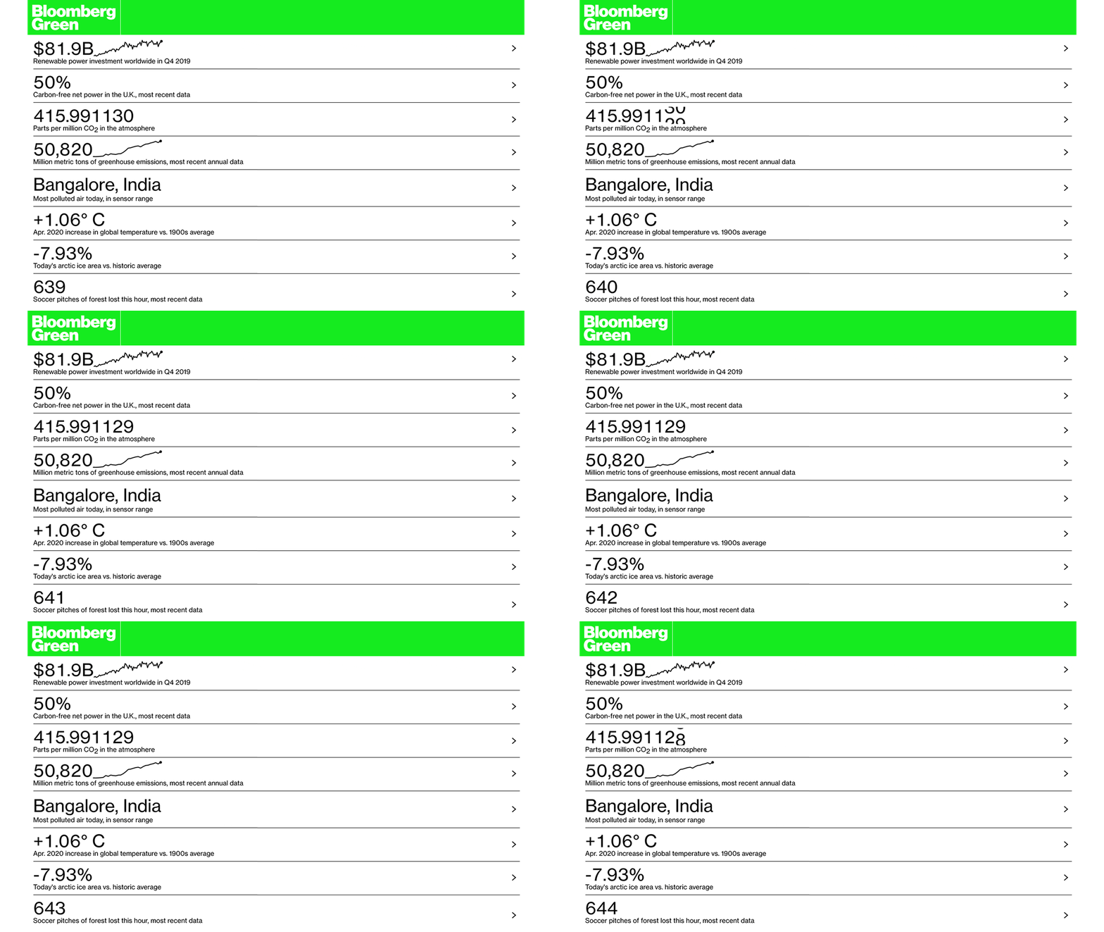
The Data Dash panel is the main constant on Green article pages. It aims to break down the jargon of climate change into tangible numbers and stories, while keeping it as current as the data is detrimental (mostly still…) to the planet. The Data Dash can also appear mid-article.

BW Haas Grotesk

Varying uses of BW Haas Grotesk can be seen throughout the Bloomberg Green site. To the left is an example of using Haas Black Italic for pull quotes to break up an article. This style separates Bloomberg Green from other branches of the Bloomberg universe. All Green articles also rely exclusively on Haas for the body copy instead of Publico, the serif frequently used across other Bloomberg sub-brands. The headlines for all articles are exclusively set in Haas Black.

The Colors of Bloomberg Green
Information Graphics
Infographics for Bloomberg's company-wide Toaster system, with Green preset options.
Data Dash Goes Large

The Data Dash splits into a multitude of informational sections with eloquent info-graphics, helping the viewer get a clean, concise, and correct idea of what the planet’s current state is and the direction it is going.


With an emphasis on clear, simple language, the infographics evidence the drastically changing homeostasis of the planet. The Bloomberg Carbon-Clock is a real-time estimate of the worlds CO2 levels, matched with other graphics of similar calibre—the urgency of todays climate-change made apparent. Already a forthright topic of the last decade(s), 2020 is going to see a whole new area of numbers and new findings due to beloved Covid-19 and its result, our current pandemic.

Presenting the information in an accessible, exciting, and identifiable way was paramount for the Data Dash. Some infographics are filled with imagery, a so far unusual way to present information for Bloomberg.

With a level of transparency, Bloomberg Green makes for a more “human” news source. By offering how information has been sourced, graphs researched, and numbers quantified, it allows for a better understanding of how the data was calculated.


The standalone site for the Dashboard was designed and developed by: Eric Roston, Mira Rojanasakul, Paul Murray, Brittany Harris, Demetrios Pogkas and Andre Tartar

Horizon Images
A subtle direction, such as the one above, only using images with a clear horizon line, we believe is how Bloomberg Green can keep the global scale of climate change present.
Article Types

Daily Newsletter

We end this project description with one of the more important channels for Bloomberg Green, the Bloomberg Green Daily, Weekly and Monthly Newsletter, ready to arrive in your inbox, if you choose to.

Process
Magazine
An early version of the print magazine, with the Data Dash occupying the left 1/4 of the cover and showcasing the latest data at the time of printing