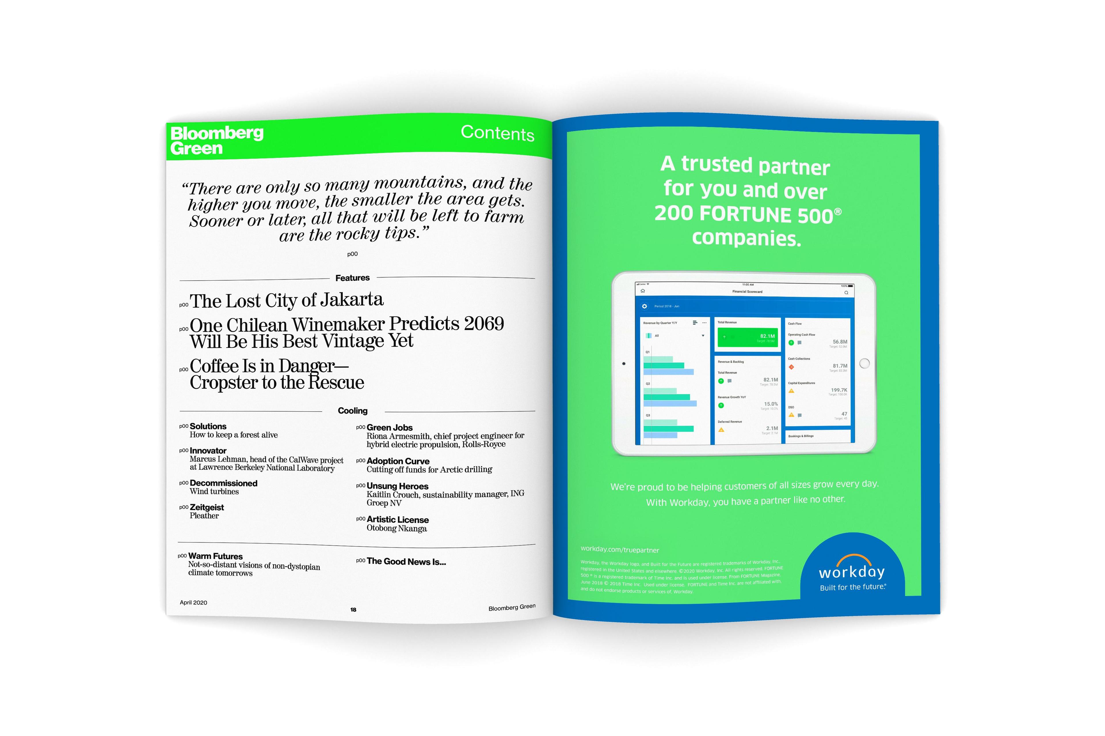
Bloomberg Green
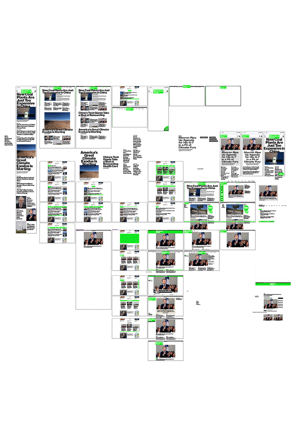
For the creation of Bloomberg Green, a multi-channel editorial platform focused on the intersection of climate change and business, Karlssonwilker was called upon to create branding, UX/UI, and digital and print design. Our task was to walk the line between designing a strong, compelling identity and ensuring that it fit seamlessly into Bloomberg's suite of other brands. Since the topics of climate and finance are centered around ever-shifting data, Bloomberg Green's editorial strategy relied on easily customizable charts and infographics. We worked closely with the in-house team to create a visual language that was clear, accessible, and easy to replicate in templates and content management systems.
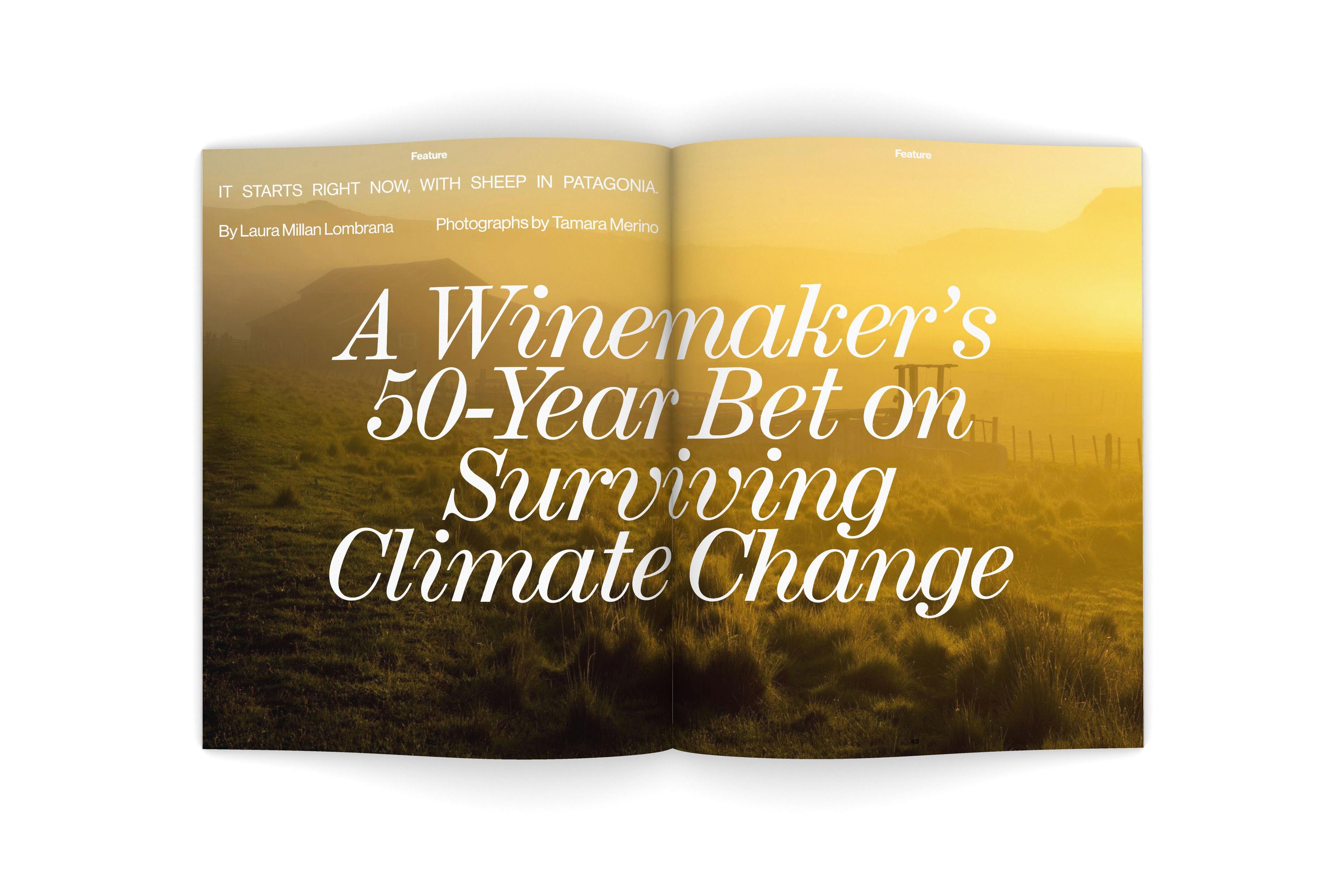
We also aimed to soften the data-driven structure with visuals that connected the topic back to nature. Hence, we introduced gestures such as using background photos for the infographics and only using images with a clear horizon line. We also introduced a gradient green streak that runs along the edges of feature stories. On digital images, the green slowly rises from the bottom, conveying to the reader on a visceral level that we're all part of the same living, breathing organism.
- Branding & Strategy
- Website & Interactive
Varying uses of BW Haas Grotesk can be seen throughout the Bloomberg Green site. This style separates Bloomberg Green from other branches of the Bloomberg universe.
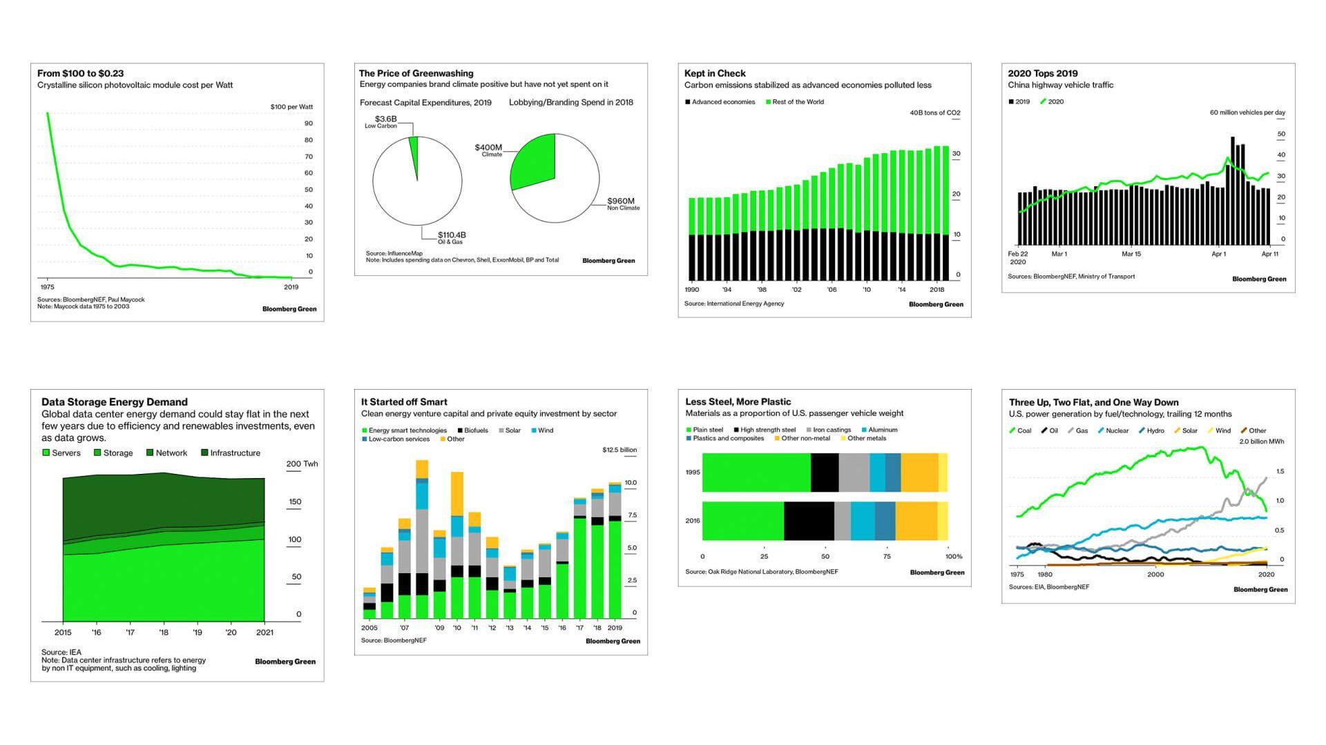
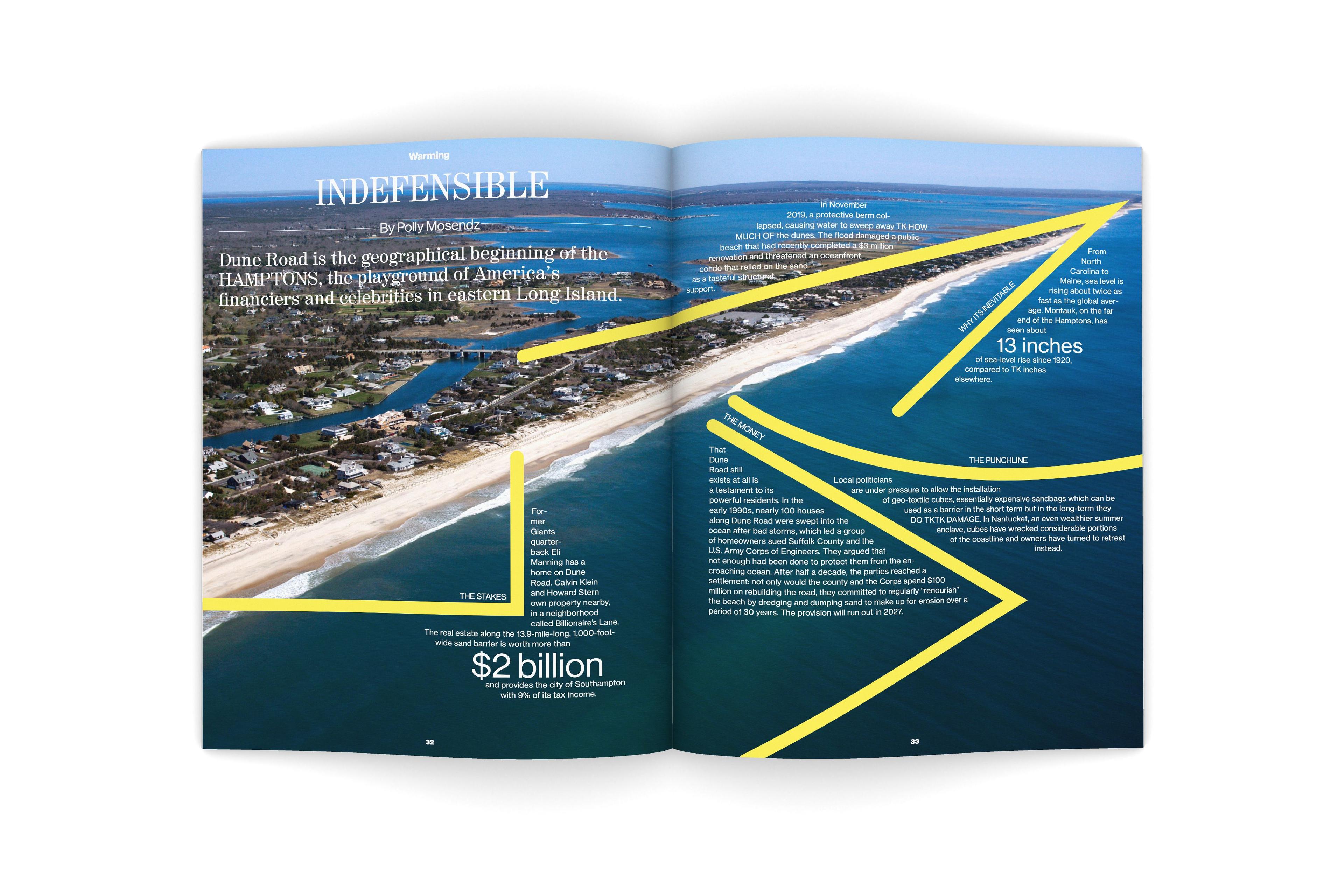
Infographics for Bloomberg's company-wide Toaster system, with Green preset options.
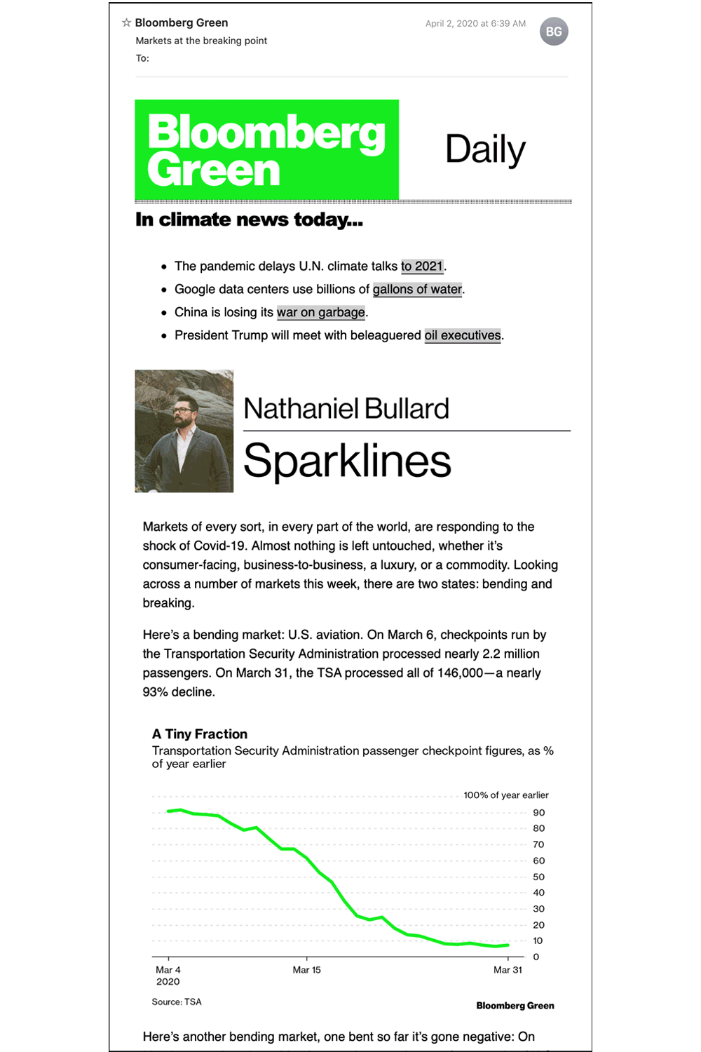
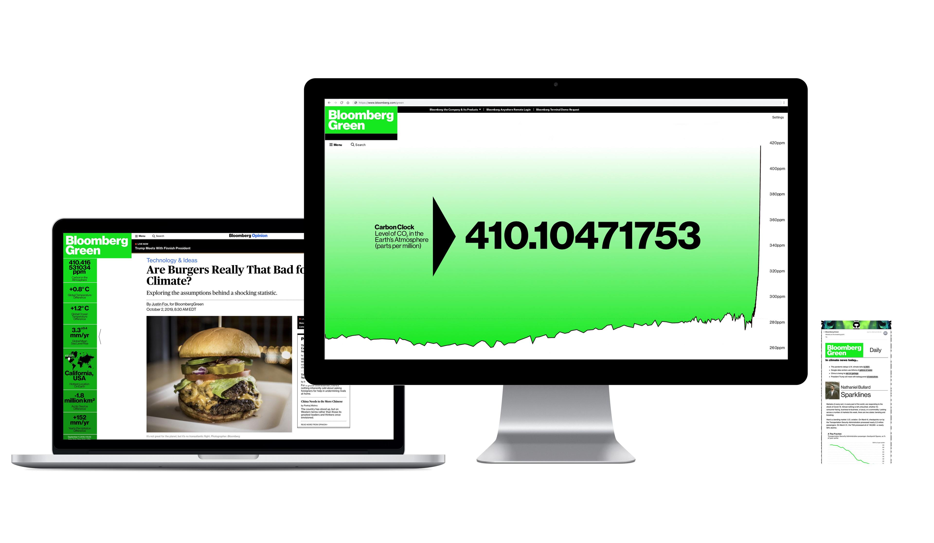
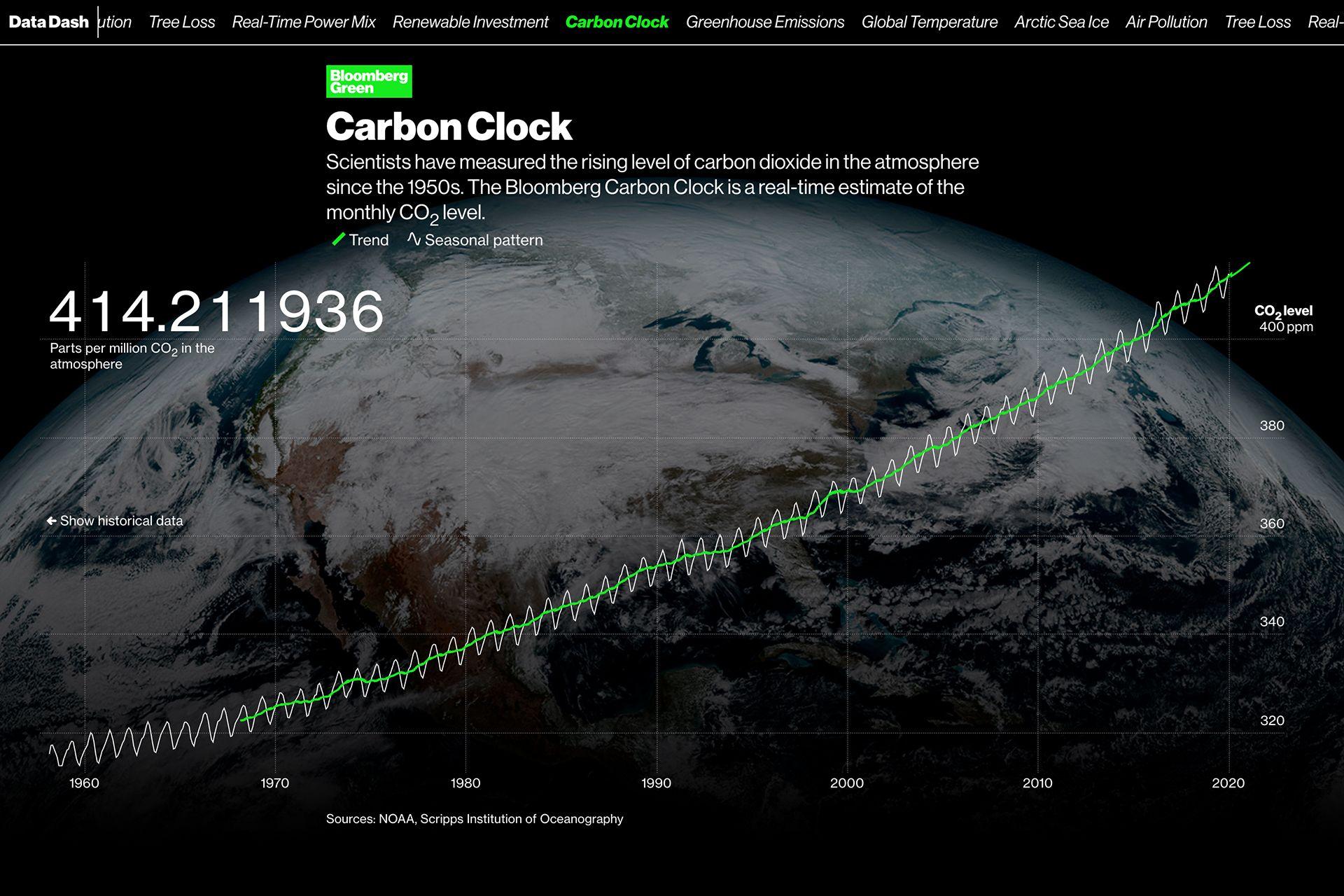
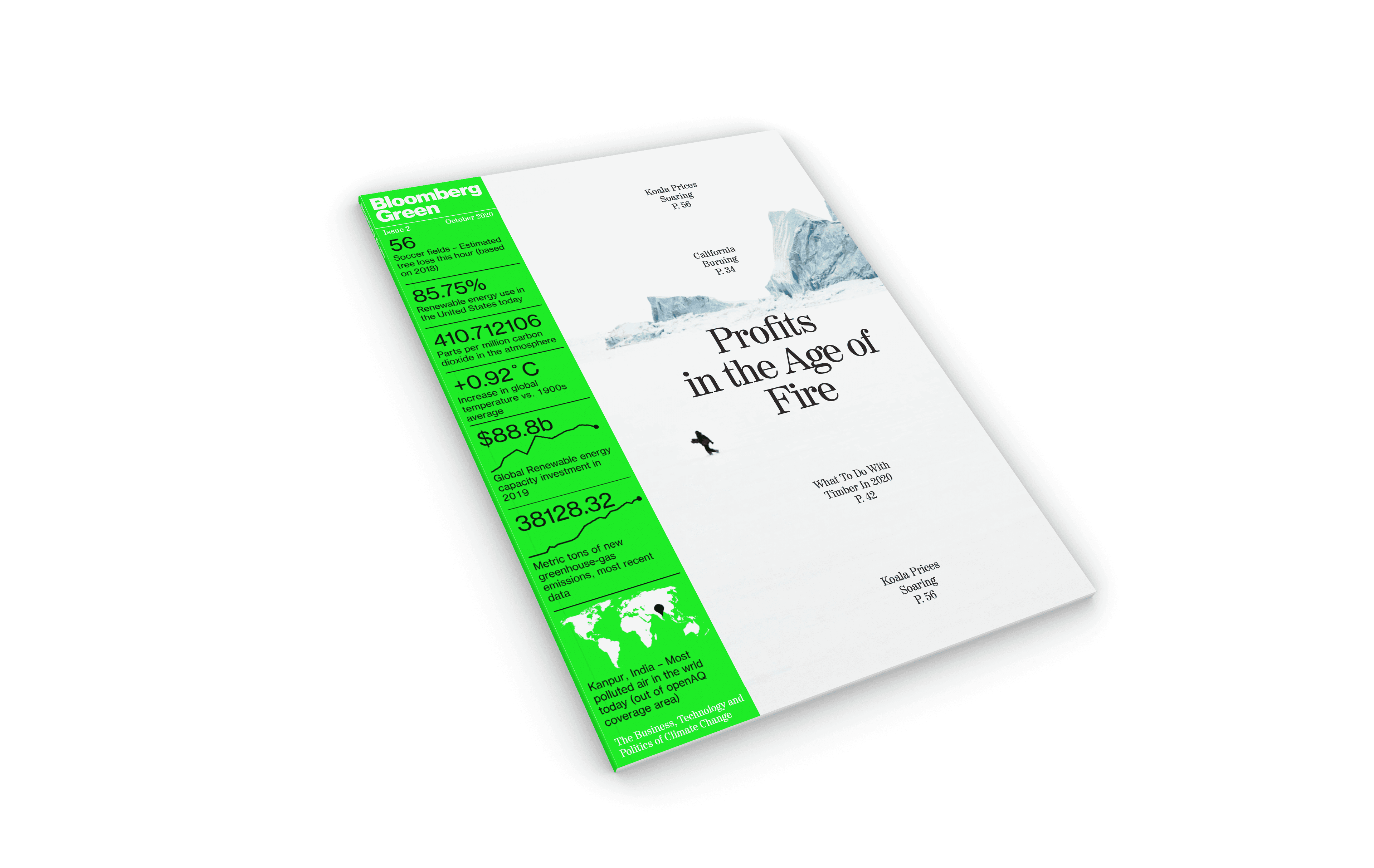
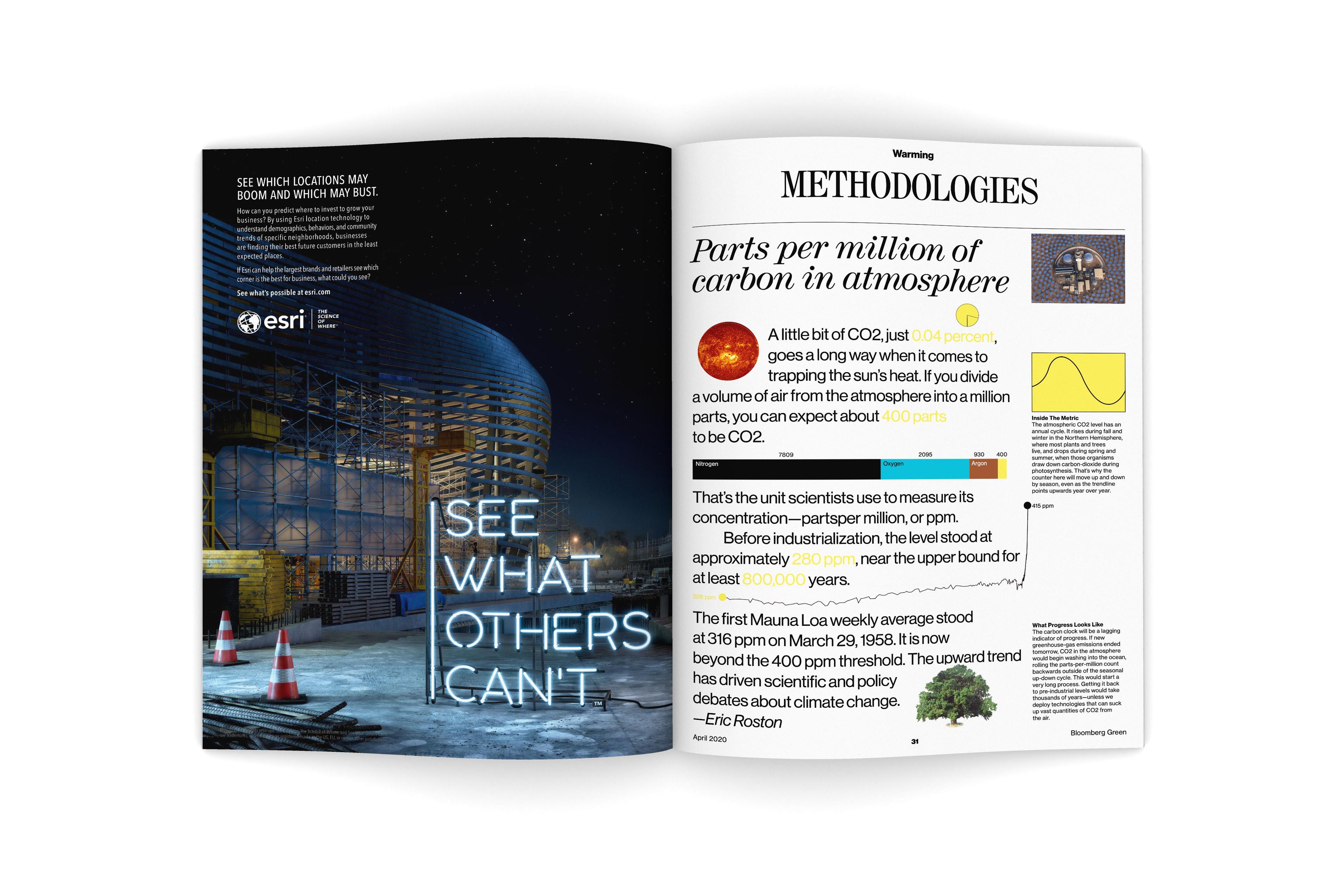
The Bloomberg Carbon-Clock is a real-time estimate of the world's CO2 levels, matched with other graphics of similar caliber.
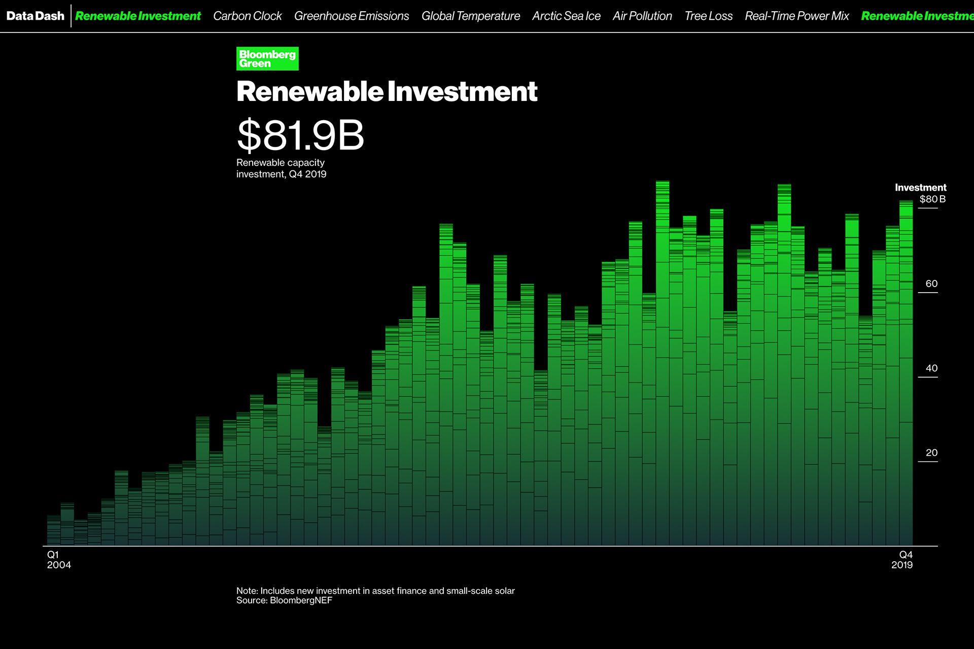
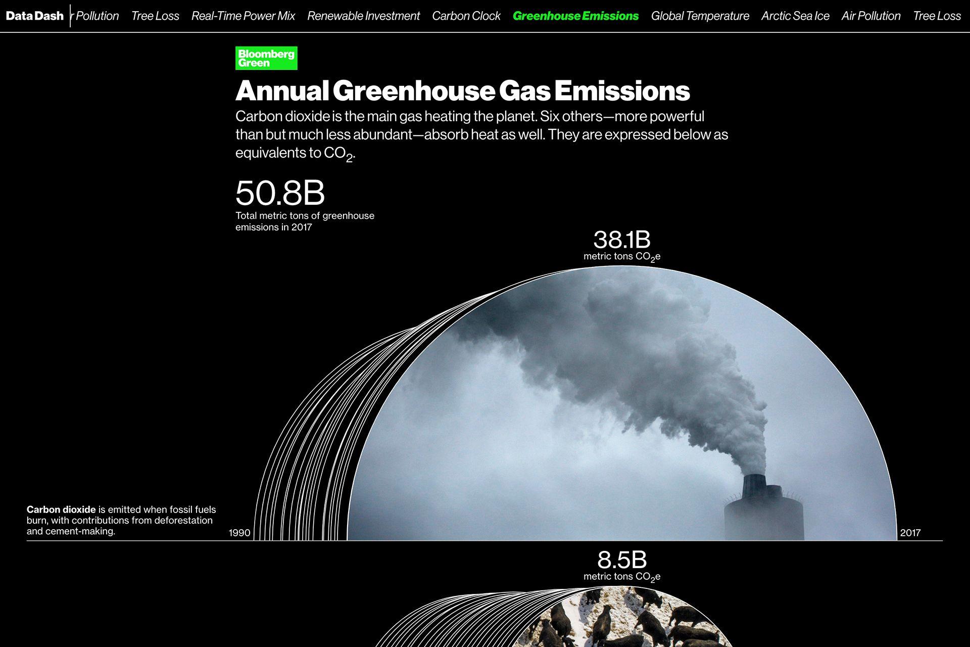
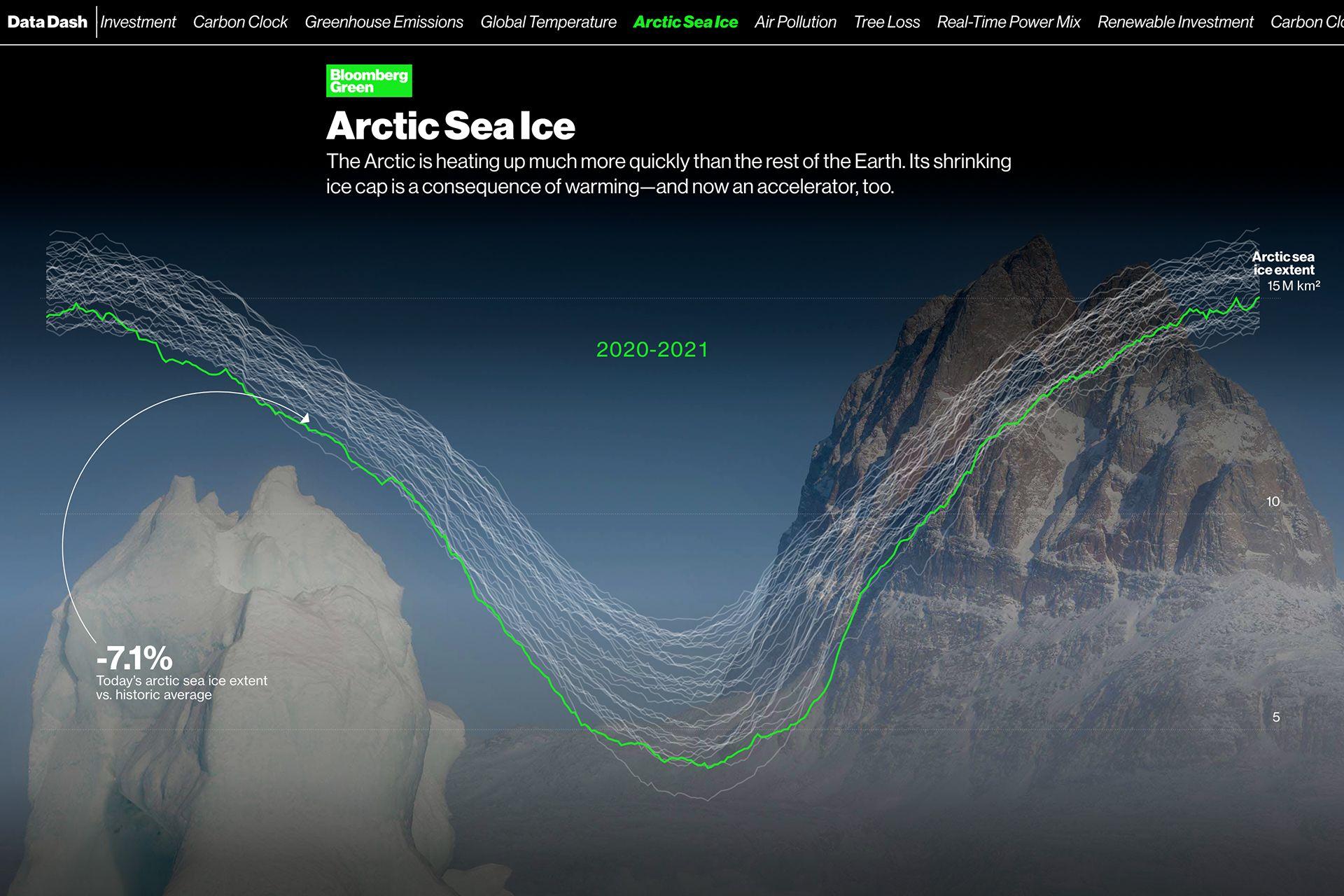
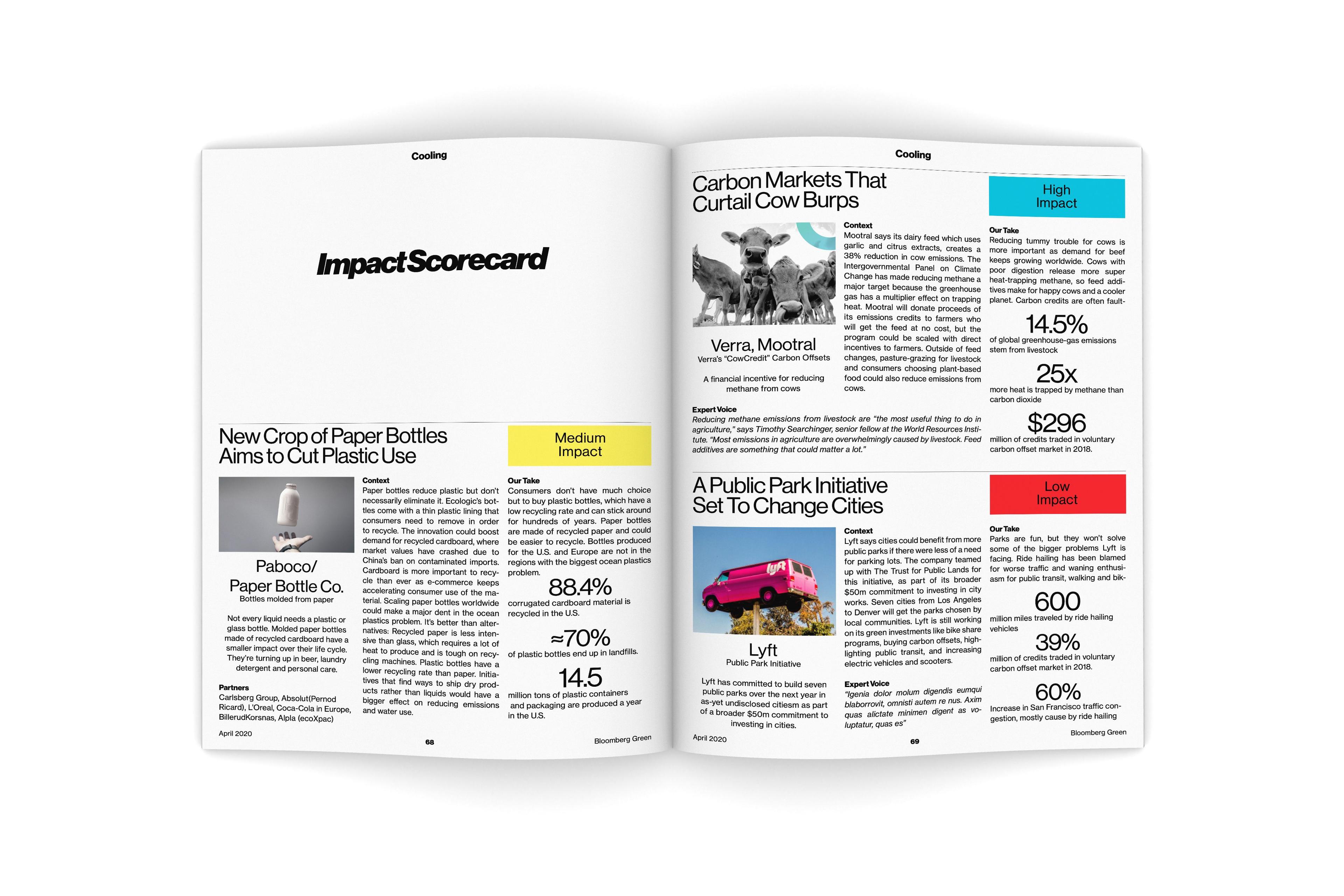
The Data Dash panel is the main constant on Green article pages. It breaks down the jargon of climate change into tangible numbers and stories.
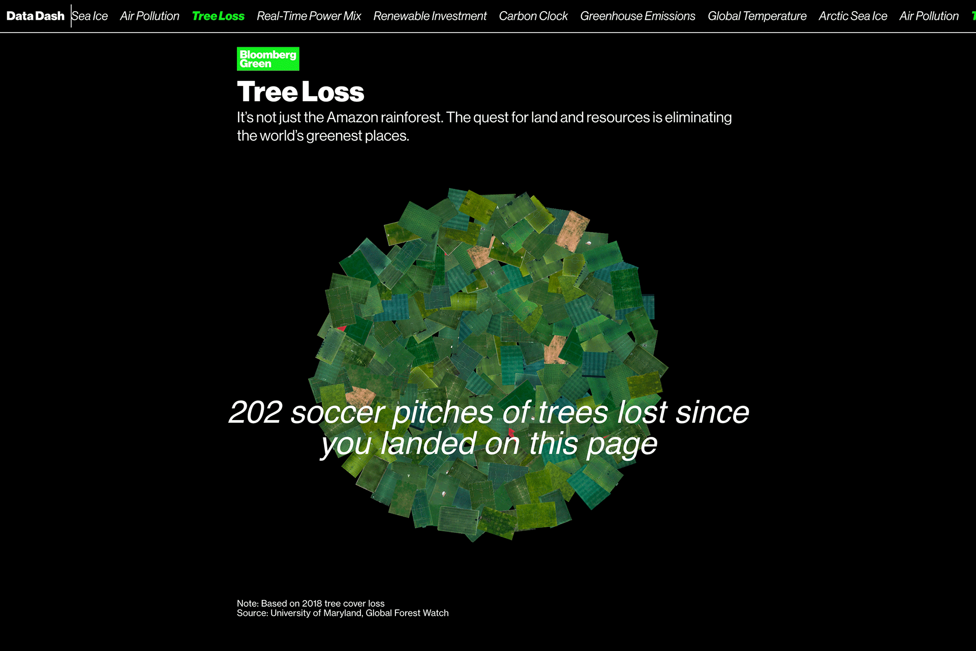
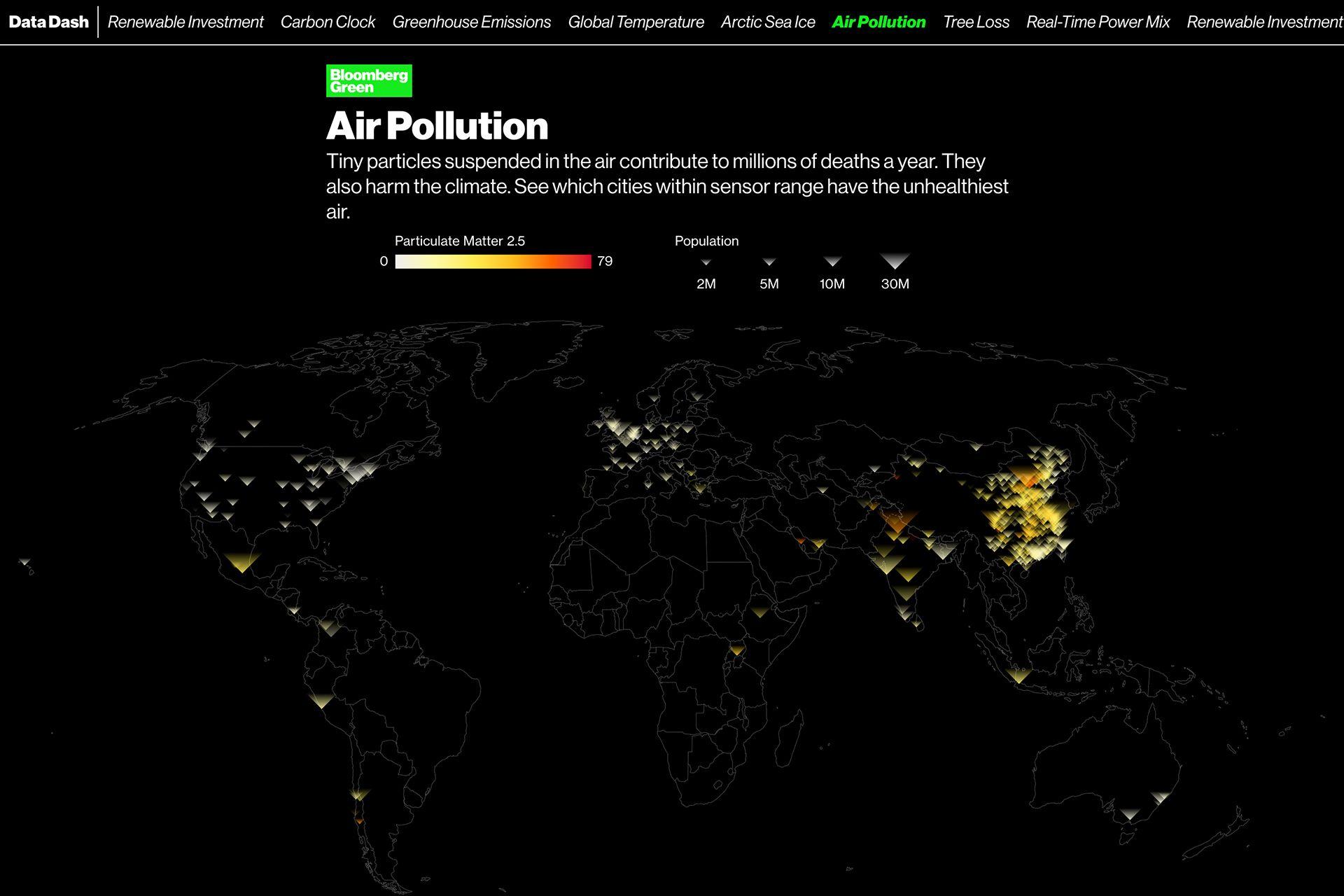
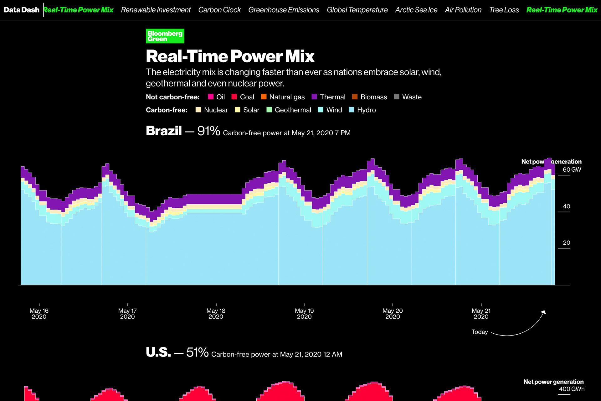
It was paramount to present the Data Dash in an accessible, exciting, and identifiable way. Some infographics are filled with imagery, an unusual way for Bloomberg to present information.