Bloomberg Businessweek
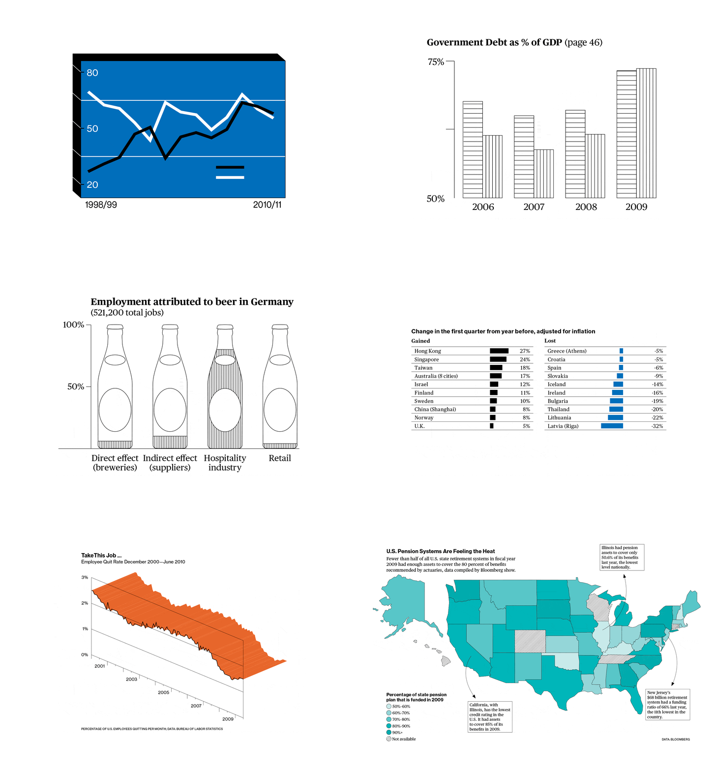
When Businessweek magazine was bought by Bloomberg, it inherited a devoted, subscription-based audience accustomed to the look and feel of business publications. The magazine’s new positioning and redesign was headed by Editor-in-Chief Josh Tyrangiel and Creative Director Richard Turley. We were brought onto the team to develop and implement the magazine’s infographic and data visualization system. We were then responsible to deliver a comprehensive style guide, showcasing a system that lives within the new magazine’s typography and grid layout, to be used by the future in-house infographics team.


This infographic system allowed individual infographics to become beautiful a sculptural team on their own, making them clearly identifiable as Bloomberg Businessweek’s. A lot of care and attention had to be given to each graphic and the style guide systematizes the individual processes and applications; from color hierarchy and raster percentages, to stroke widths, leading, and projection angles. The magazine’s typefaces are Neue Hass Grotesk and Publico (both Commercial Type, New York & London). Over the summer months of 2010, we trained the newly hired in-house infographic team and continued to add case studies and examples to the style guide, making it a dense, varied, and in-depth collection of visualizations for a plethora of different sets of data and contexts.
With Josh and Richard at the helm, Bloomberg Businessweek quickly established itself as the leading magazine, finance or otherwise, with daring content and brash graphic design.


American Badass (2012)
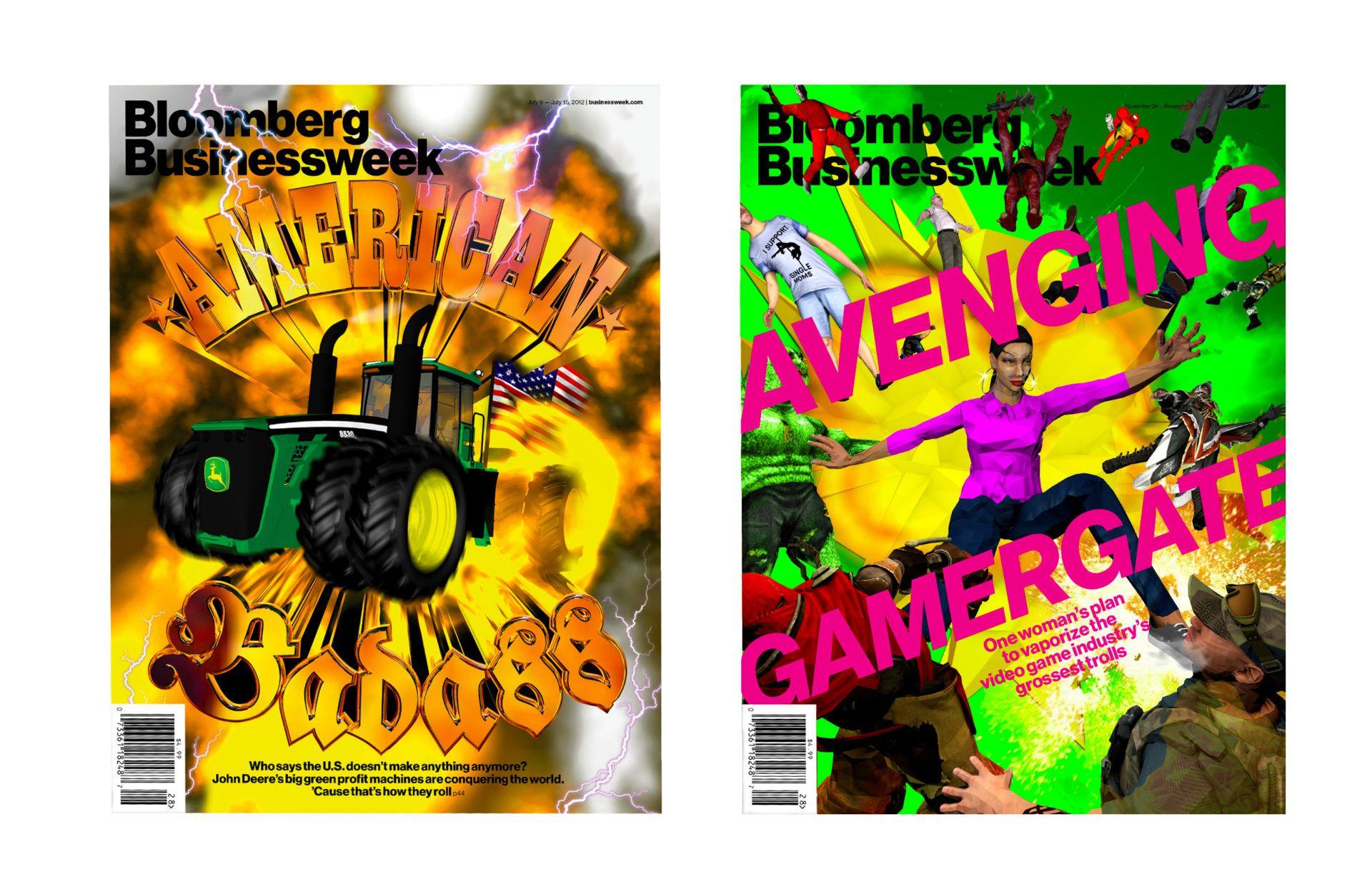
This magazine was Bloomberg’s best seller on the newsstand to date, with these types of sales figures typically being driven by the cover design. The American Badass issue featured an in-depth analysis into the usually secretive John Deere Company. The article tells the story of an American company being successful right after the economic crises, so the cover design required a sense of pride, patriotism and joy.
The design mixed a 3D model of an extra-strong tractor, a large special-effects explosion, and Americana typography.
Gamer Gate (2014)
The “Gamer Gate controversy” started in 2014 as a response to critics of the video game industry. The feminist media critic Anita Sarkeesian was one of the most notable targets of harassment for being vocal about what she considers to be a misogynist and sexist industry and culture. In the mist of #gamergate, Bloomberg hired karlssonwilker to design a cover featuring Anita and well-known video game characters (mostly male).
The design outcome was a fun, crazy cover, filled with a few Easter eggs, one of which is Hjalti’s face on one of the characters.
Process Images