
Bloomberg Businessweek
- Karlssonwilker's "American Badass" guest cover became a bestseller
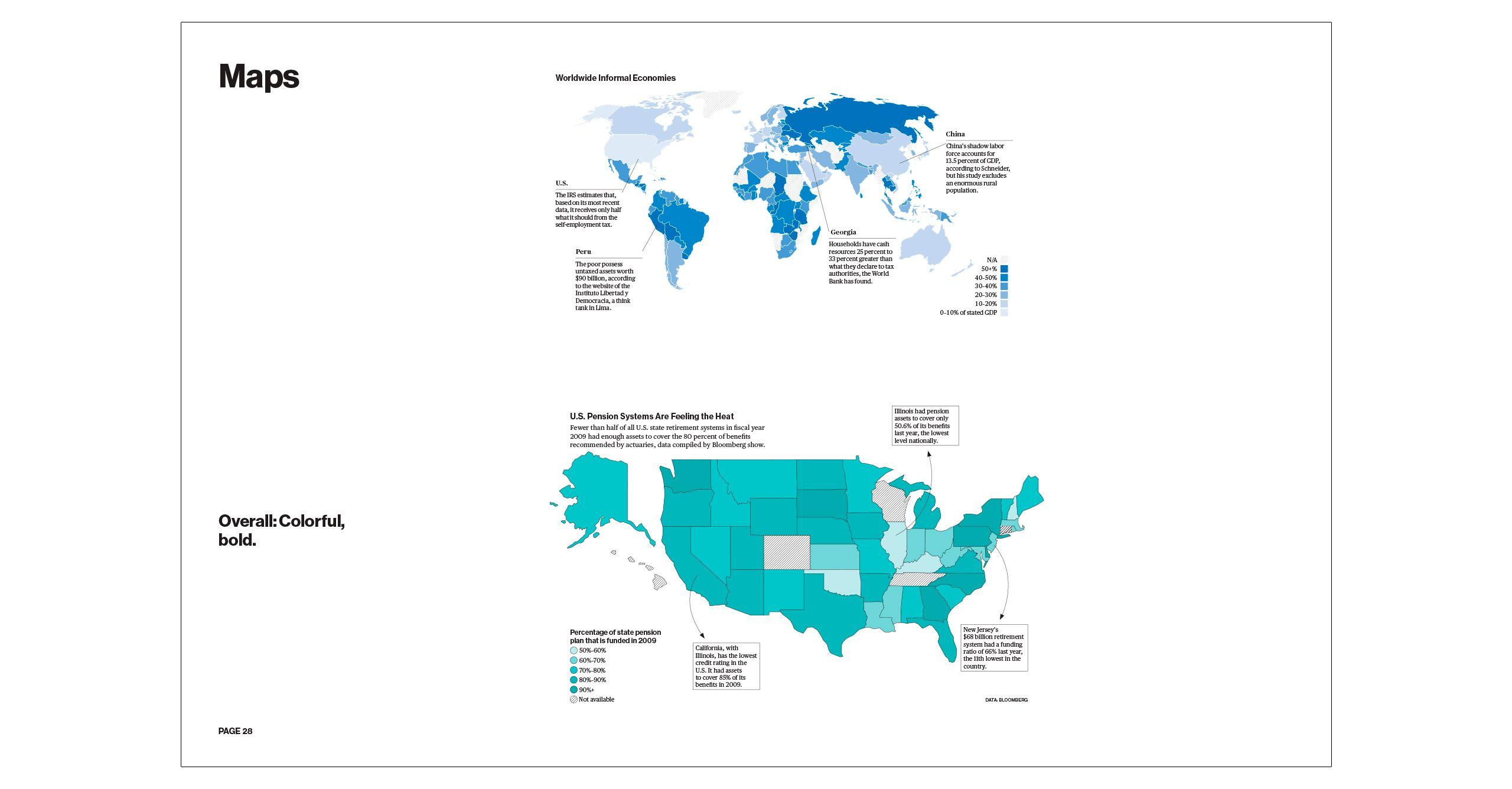
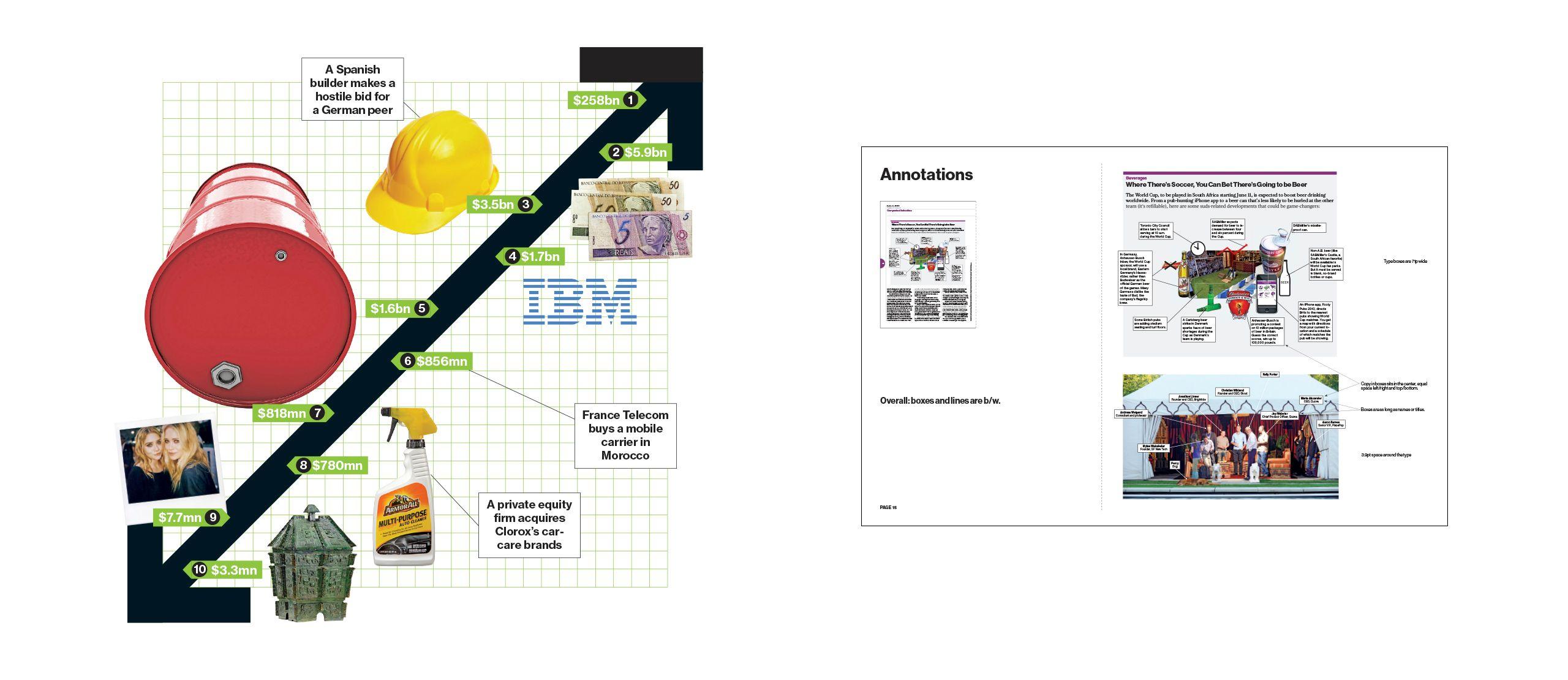
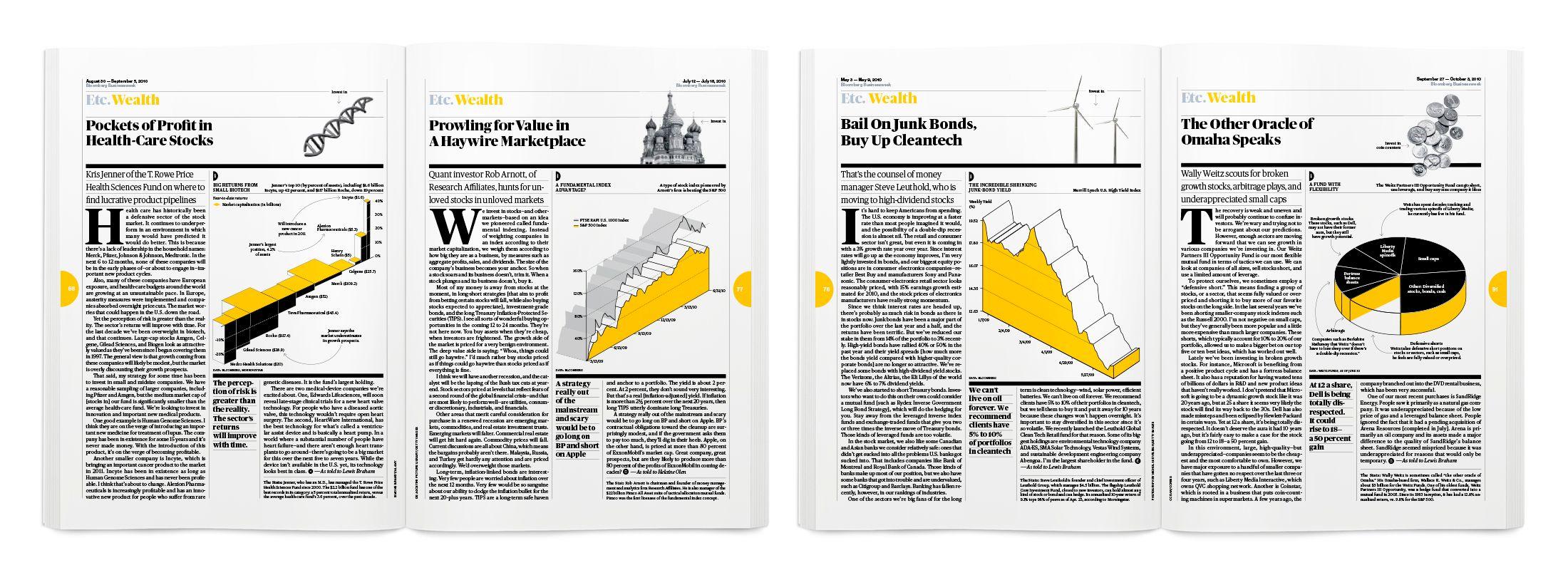
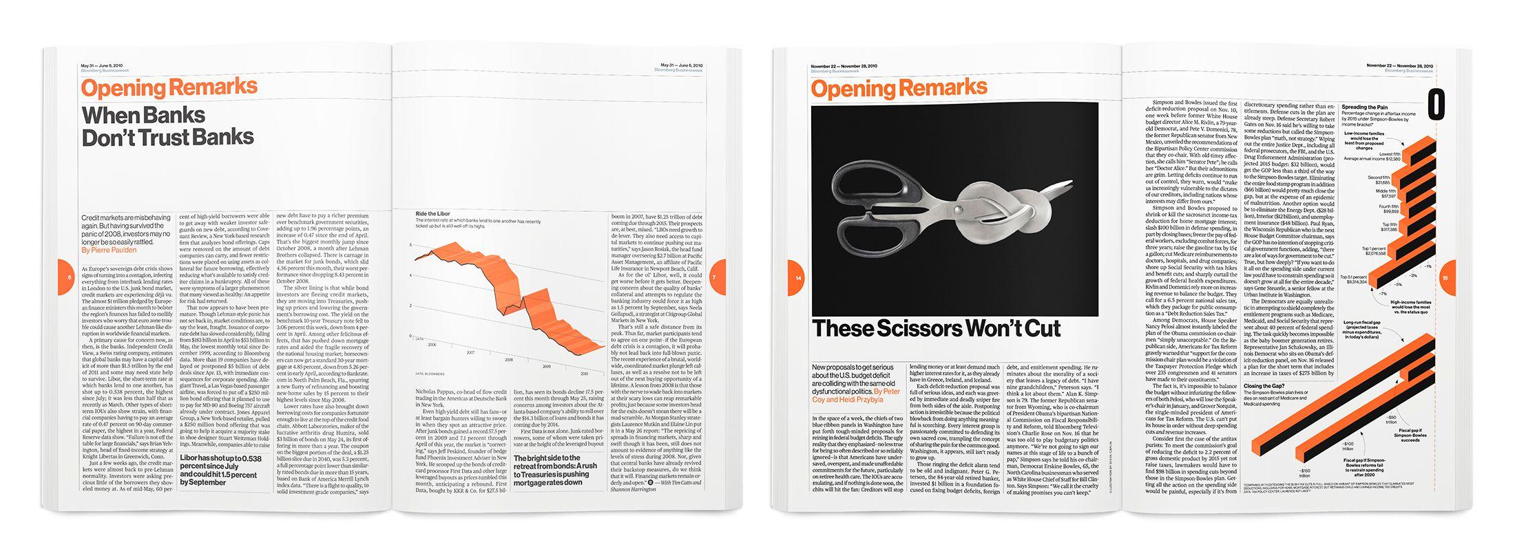
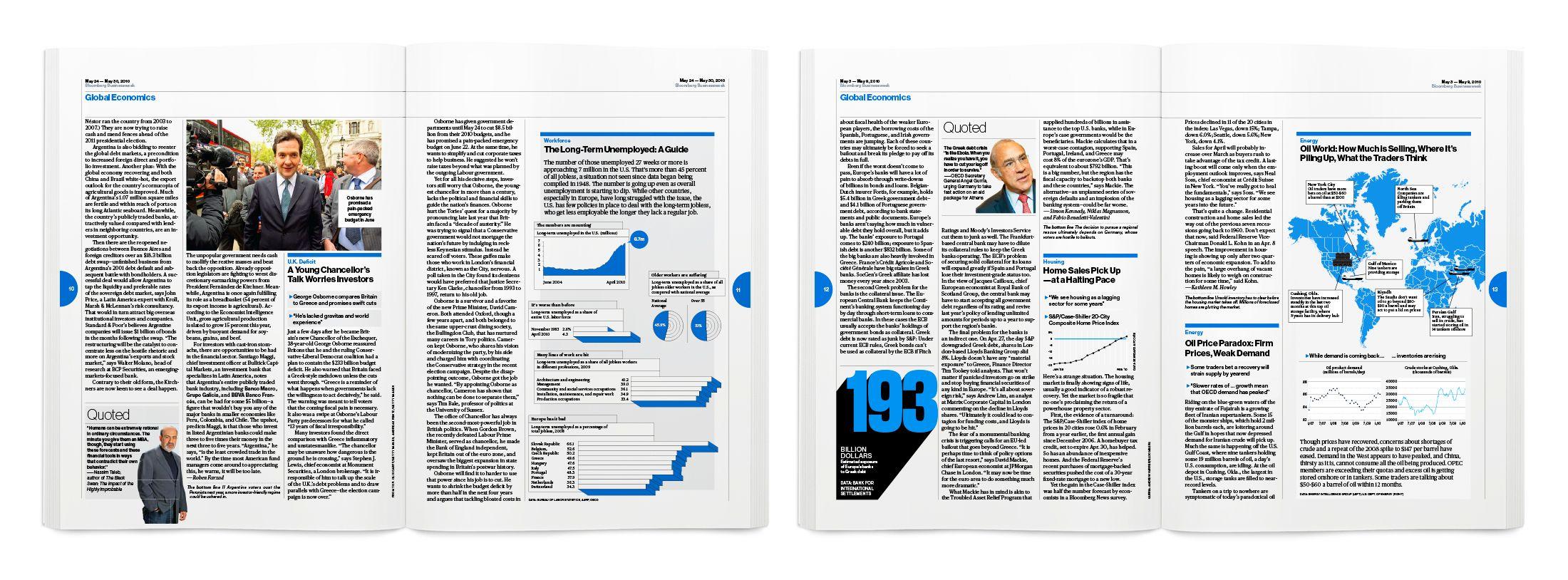
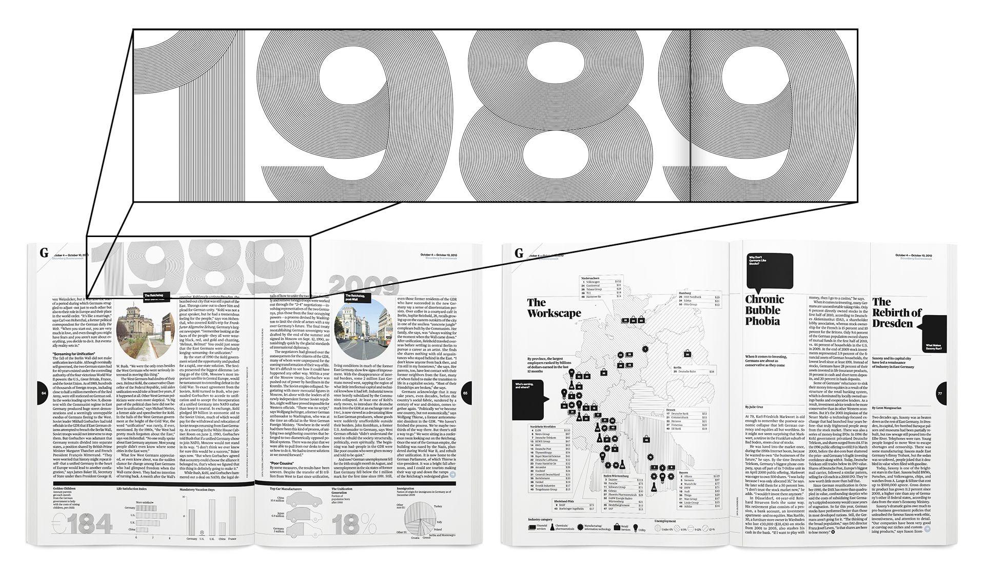
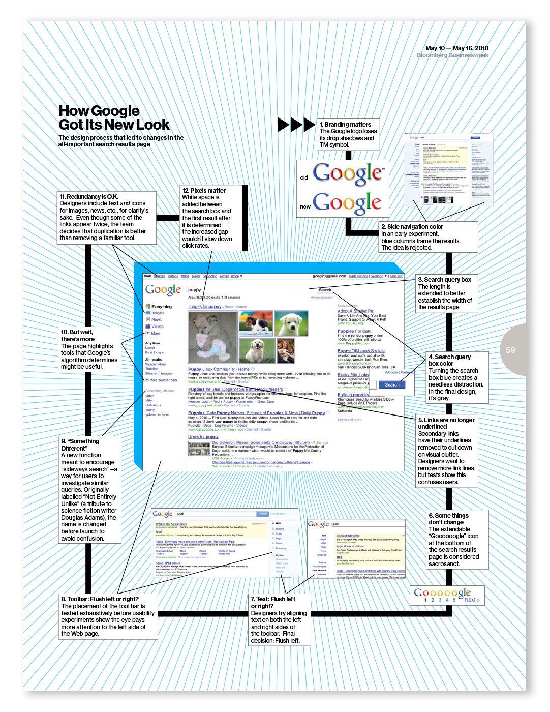
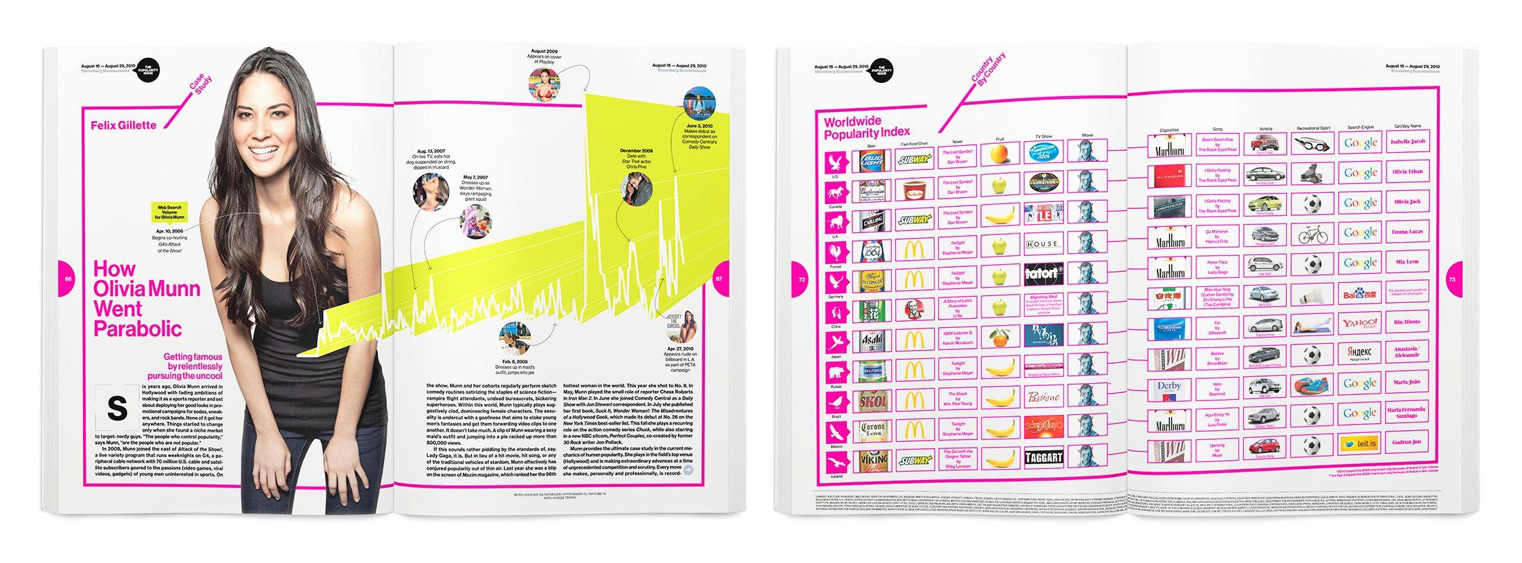
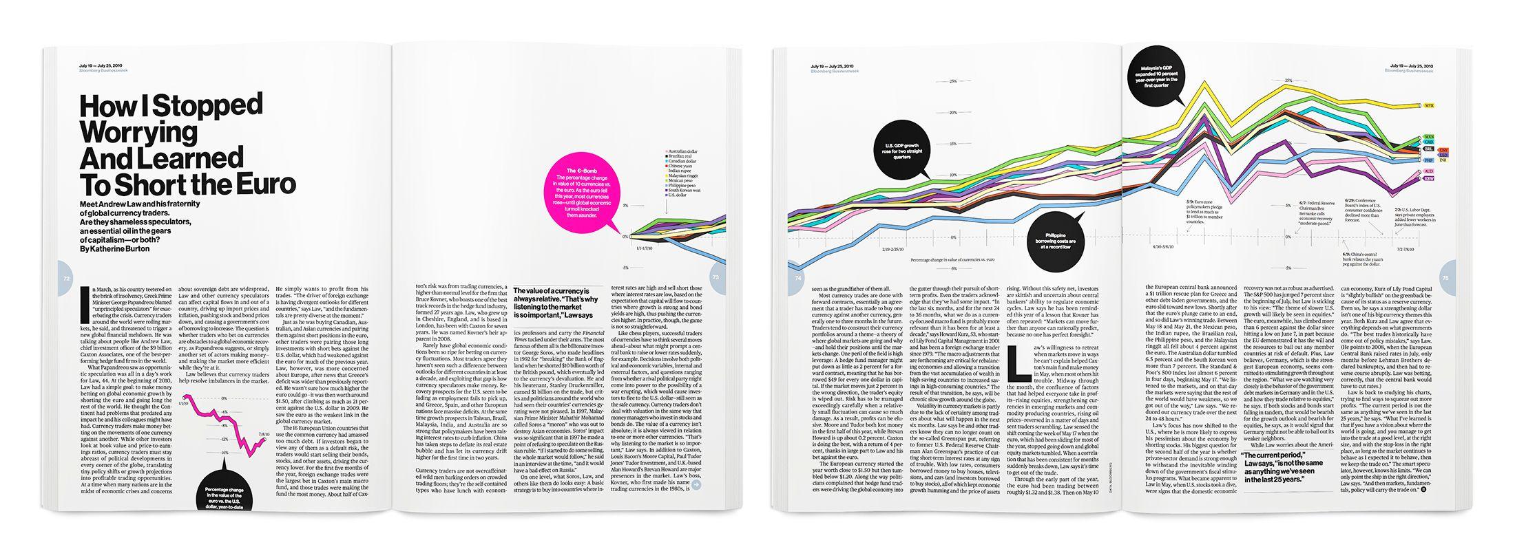
When Businessweek was bought by Bloomberg, Karlssonwilker was brought on board to develop a new visual vocabulary for the magazine’s infographics and data visualizations. We worked closely with the in-house Creative Director Richard Turley to rethink the conventional presentation of information and create an original system that was clear, simple, and direct while also holding a bold and sculptural presence on the page. The result was a dense, varied, and in-depth collection of visualizations that was clearly identifiable as Bloomberg Businessweek’s. Finally, we delivered a comprehensive style guide and trained the newly hired in-house team over several months. Bloomberg Businessweek quickly established itself as the leading finance magazine, with daring content and brazen graphic design.
"Working with Karlssonwilker allowed us to re-contextualize the way we thought about graphics. Their conceptual strength and the magazine's flat, granular brief was a very good pairing. When they came on board, the magazine was in a state of crisis, it had no direction. They helped us adapt a simple, straightforward approach that allowed the information to speak for itself. "
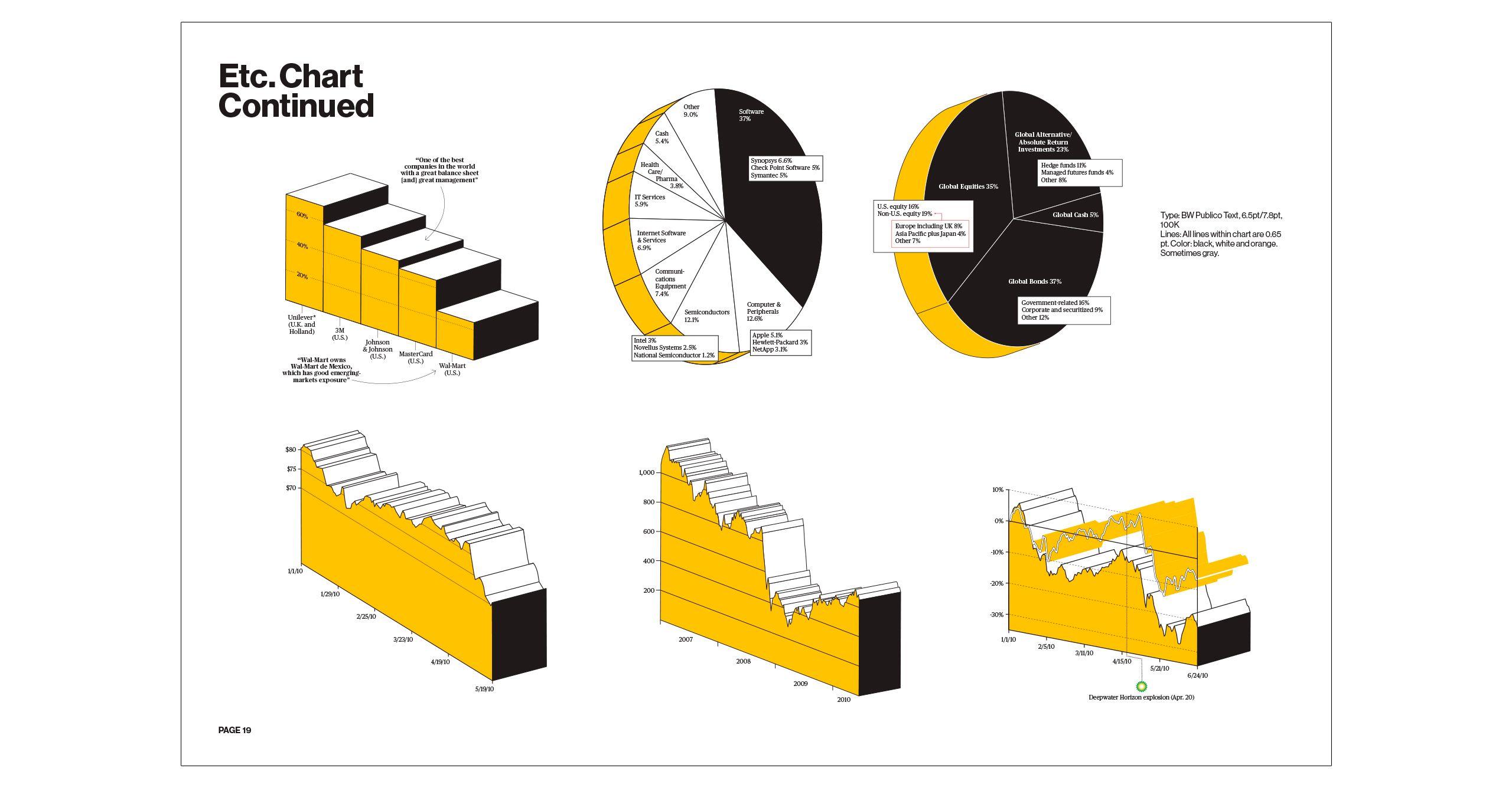
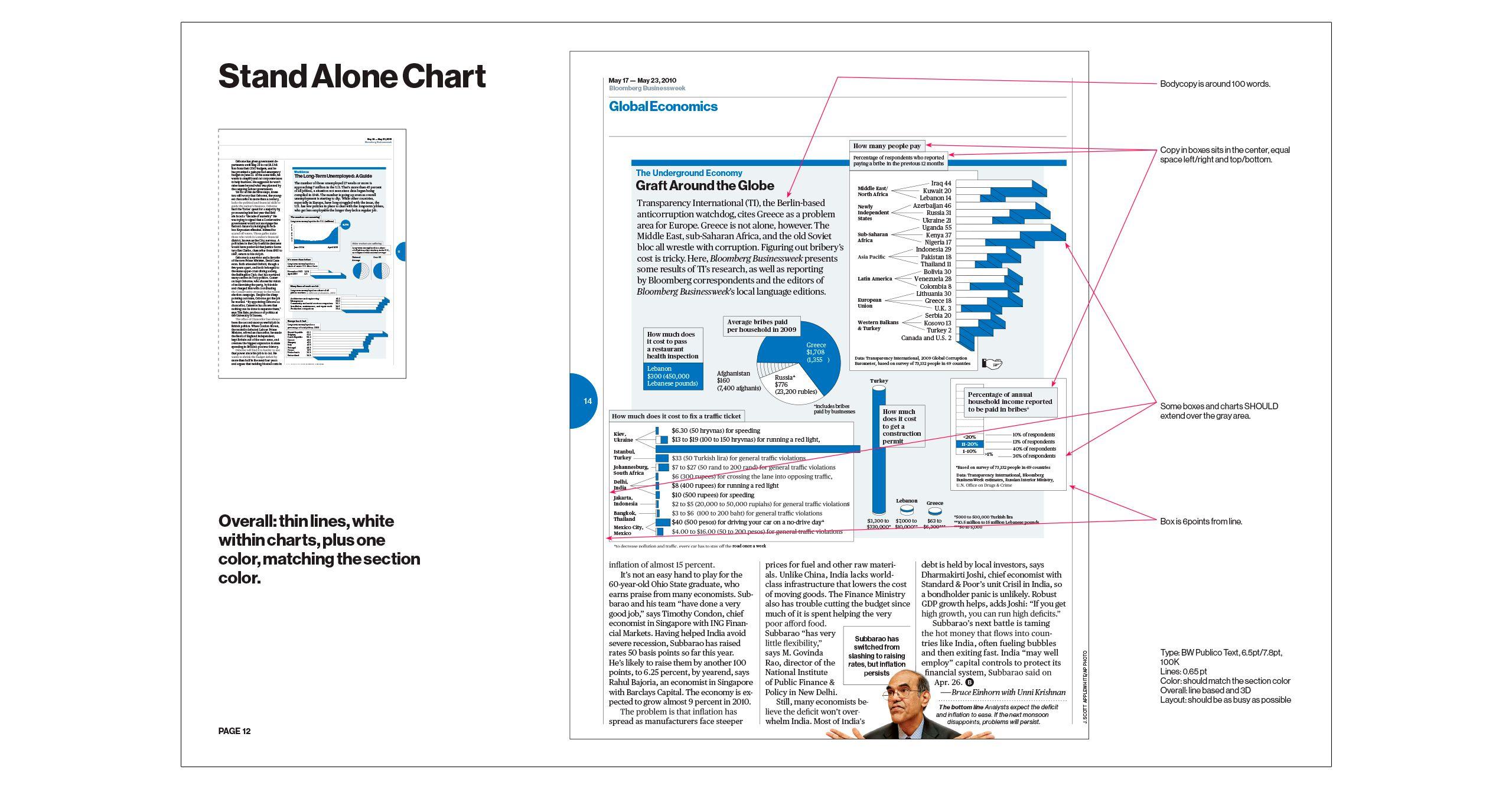
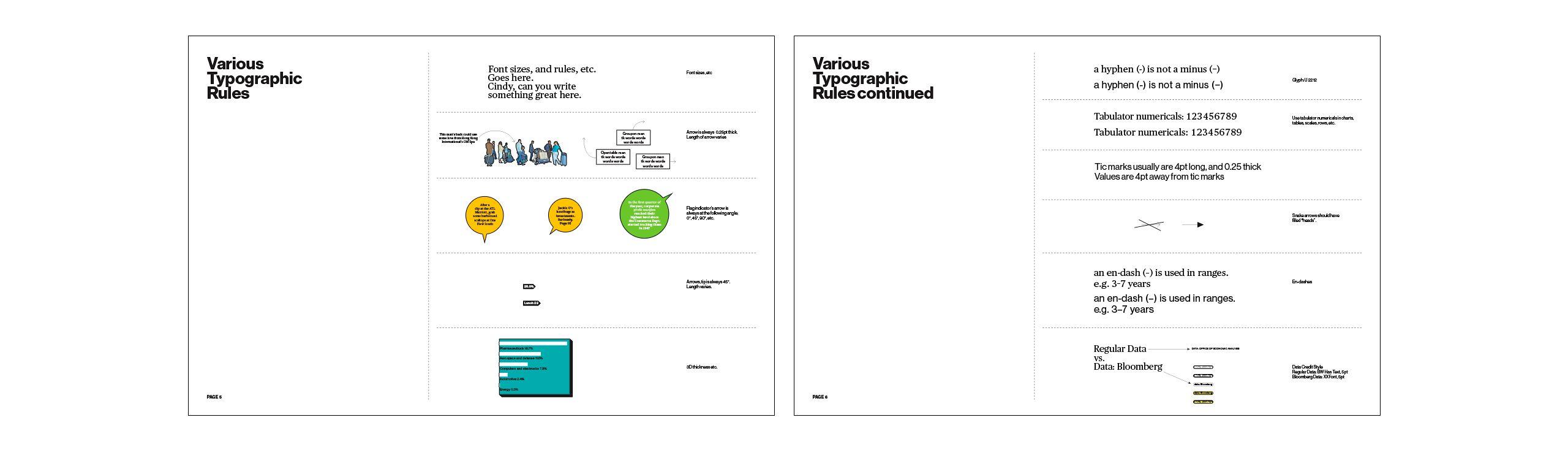
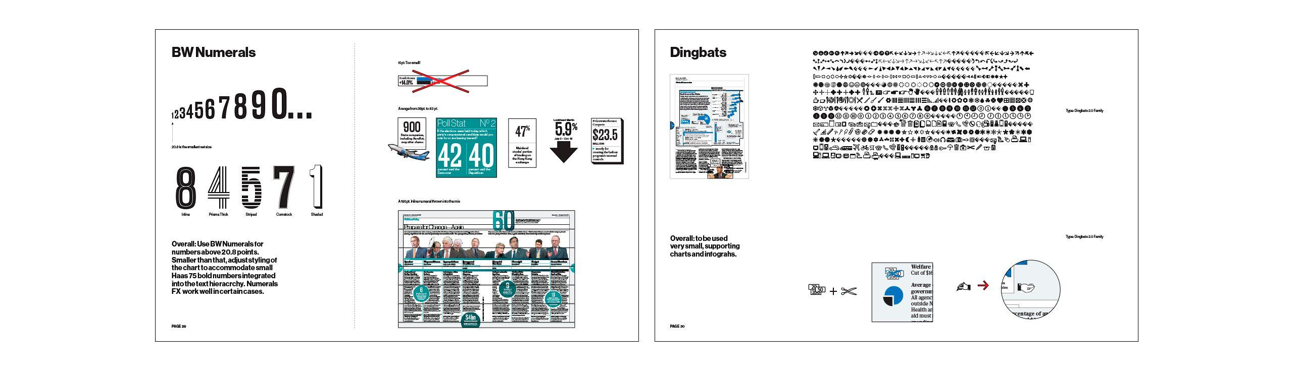
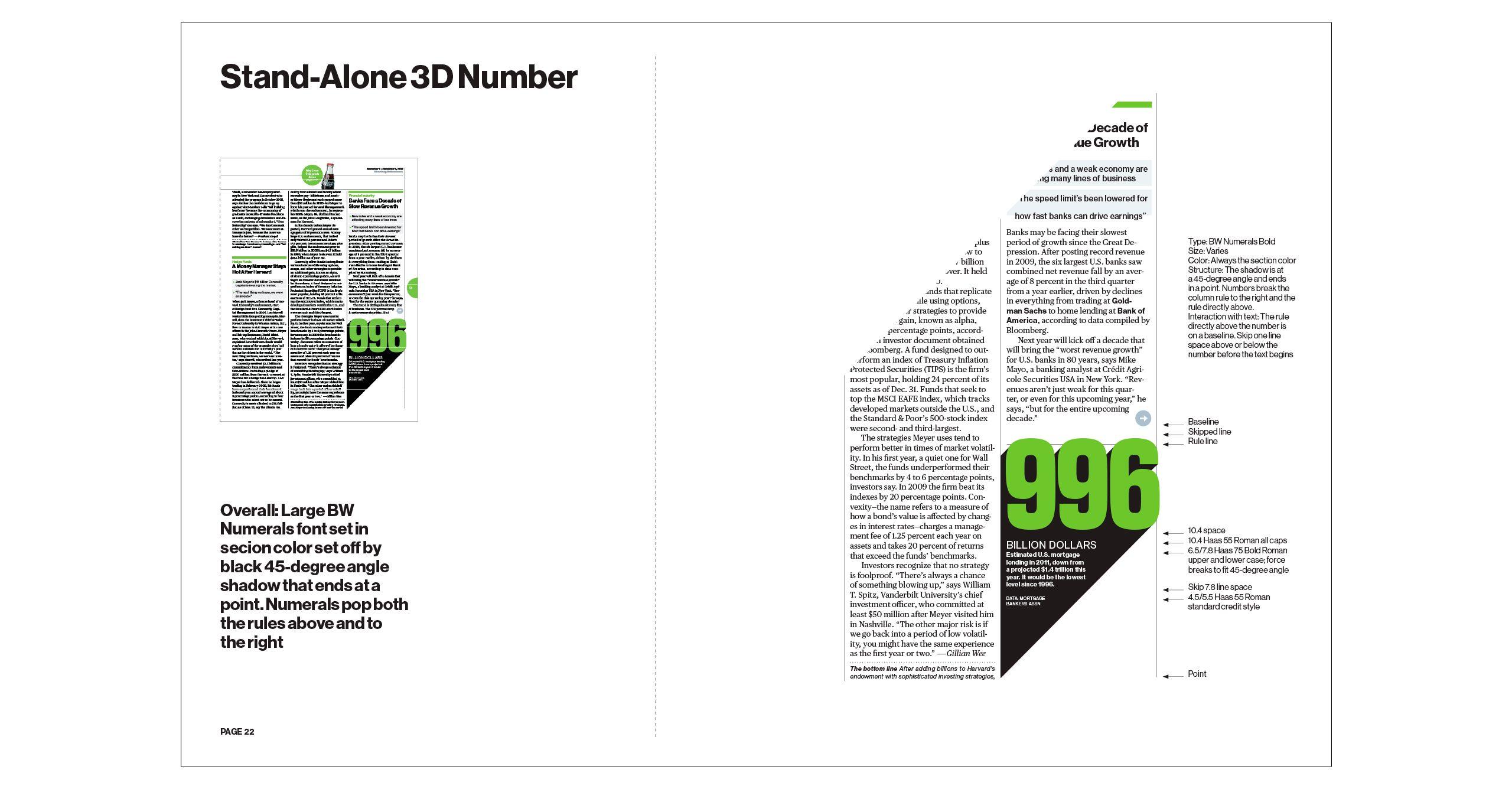
A lot of care and attention had to be given to each graphic. The style guide systematizes the individual processes and applications from color hierarchy and raster percentages to stroke widths, leading, and projection angles.
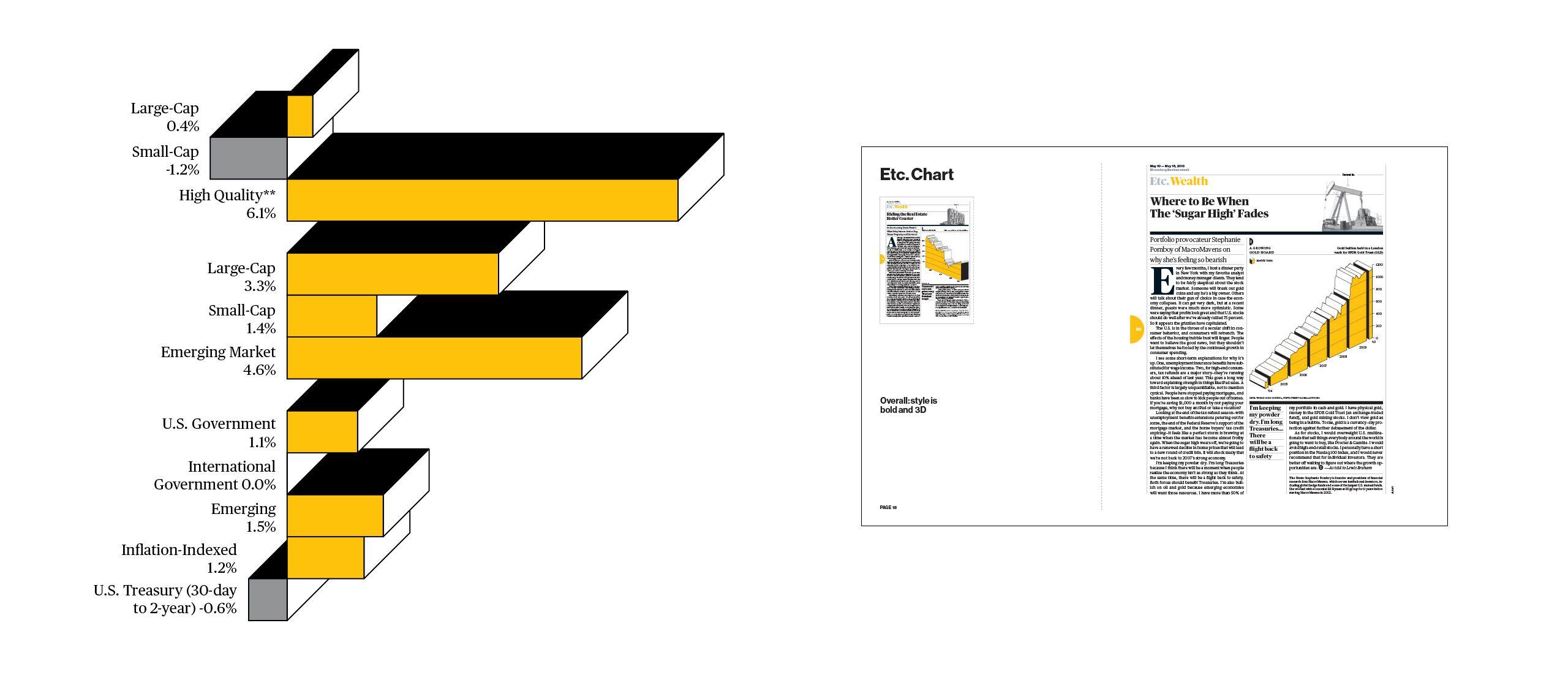
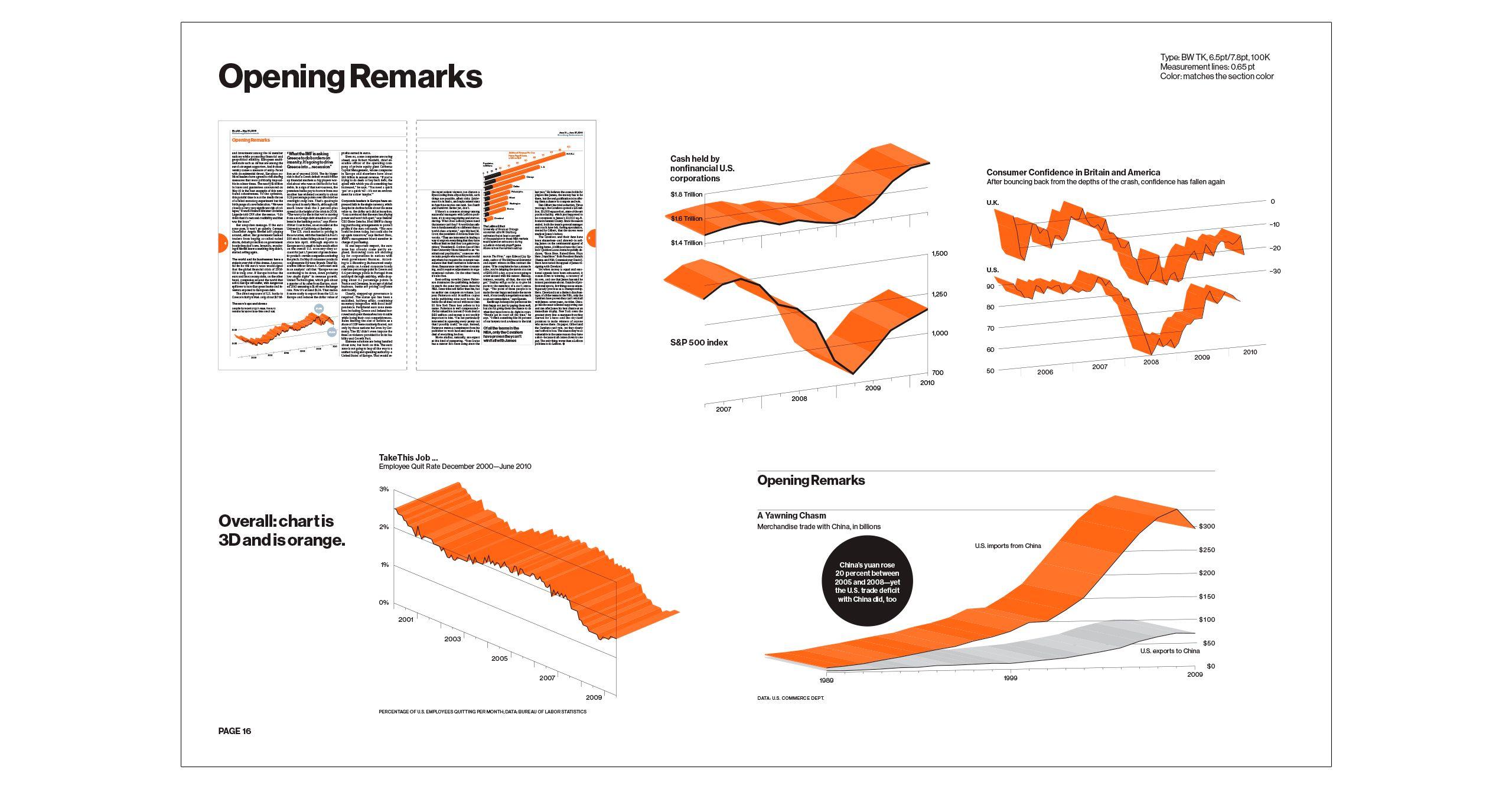
This system allowed individual infographics to become beautiful sculptural items, making them clearly identifiable as Bloomberg Businessweek’s.
The magazine’s typefaces are Neue Hass Grotesk and Publico (both Commercial Type, New York & London).
We trained the newly hired in-house infographic team and continued to add case studies and examples to the style guide, making it a dense, varied, and in-depth collection of visualizations for a plethora of different sets of data and contexts.
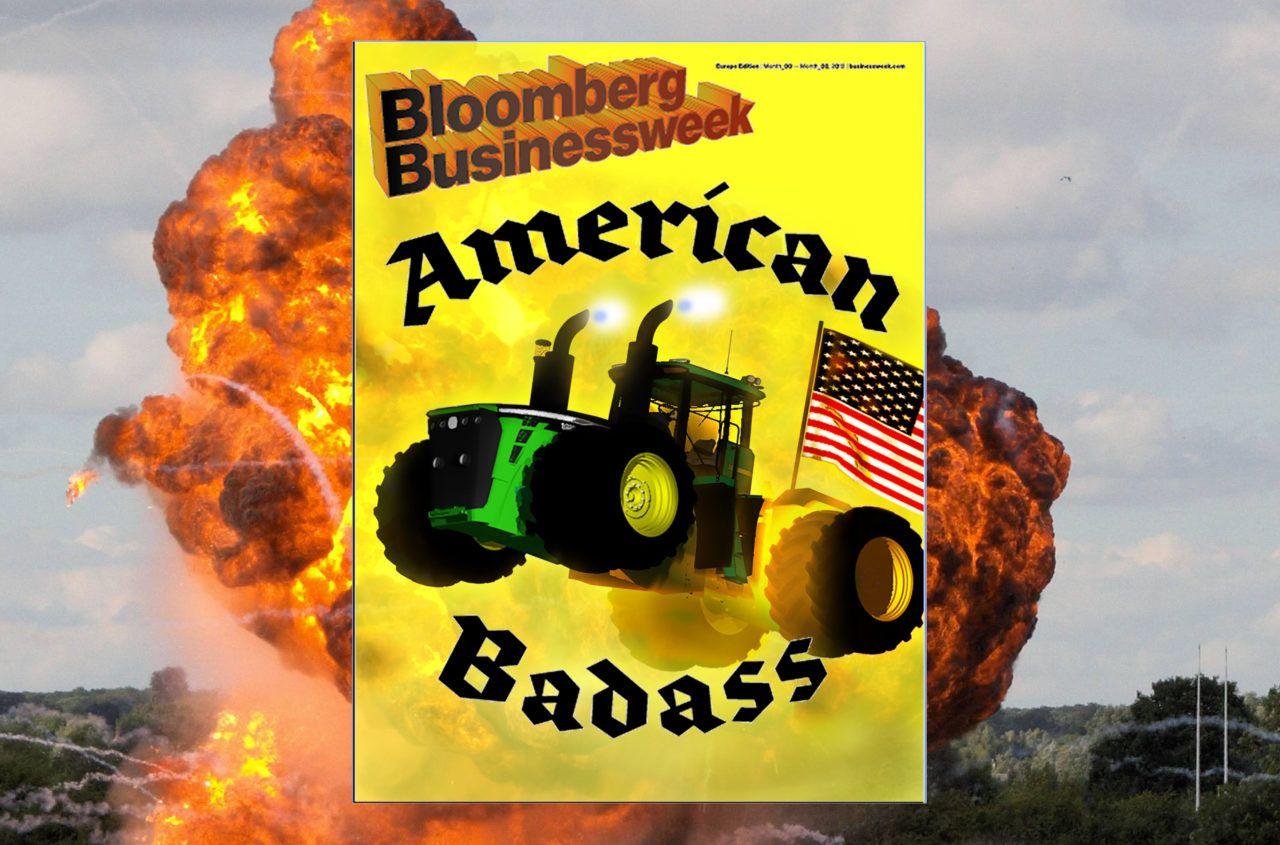


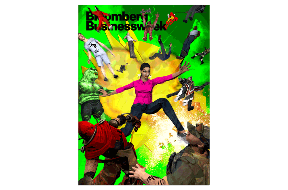
Post-launch we were invited to design two covers. “American Badass”
was a bestseller on the newsstand. The issue featured an in-depth analysis of the usually secretive John Deere Company. The design mixed a 3D model of an extra-strong tractor, a large special-effects explosion, and Americana typography.