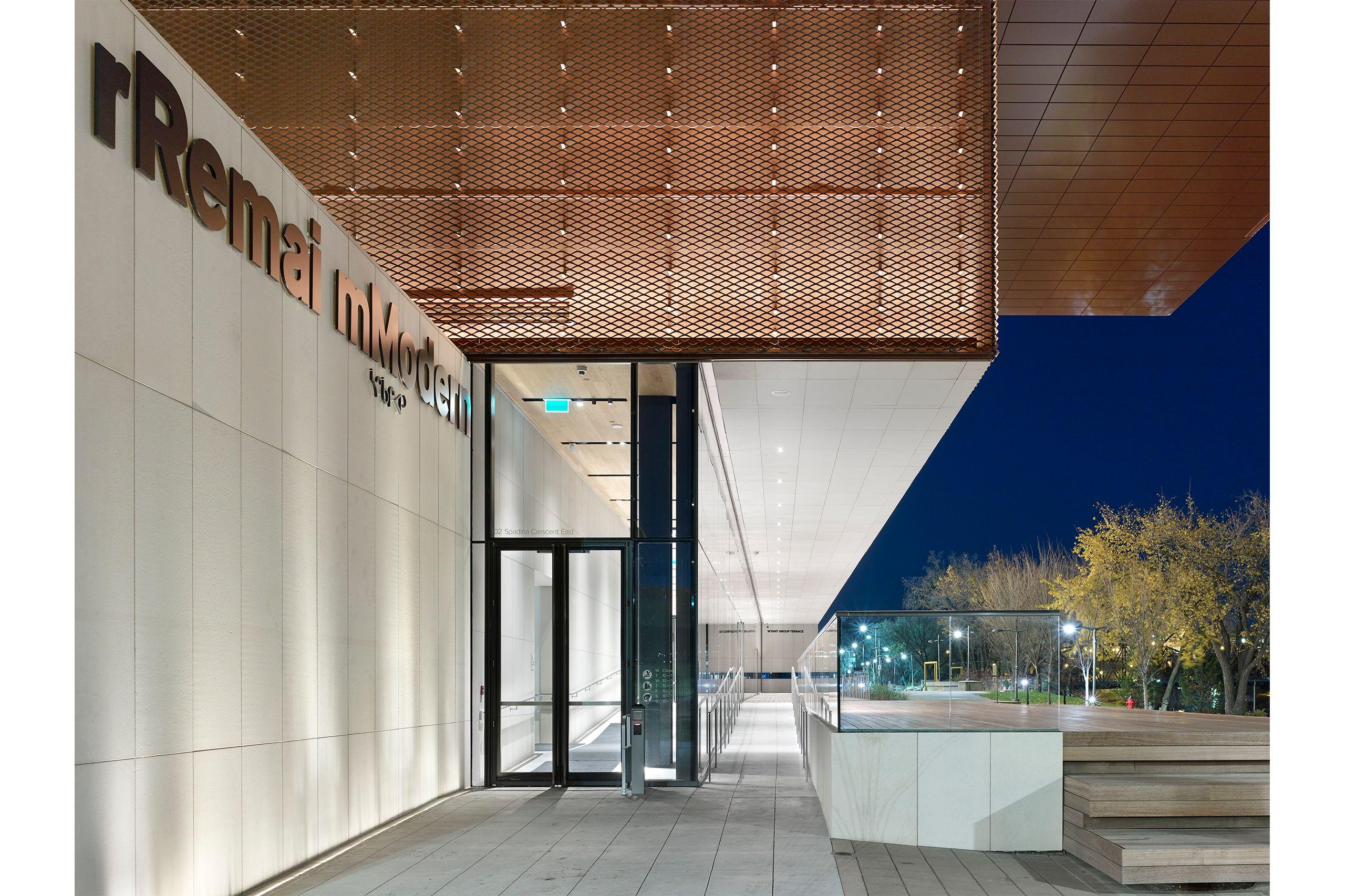
remai modern
- Branding, Strategy & Wayfinding
- Website & Interactive
While developing the graphic design identity for Remai Modern, we explored a broad range of directions. The “lower/UPPER” approach manifested itself as the ideal gesture for this Museum’s continuous quest to question itself and everything else on its path to become a type of anti-institution institution.
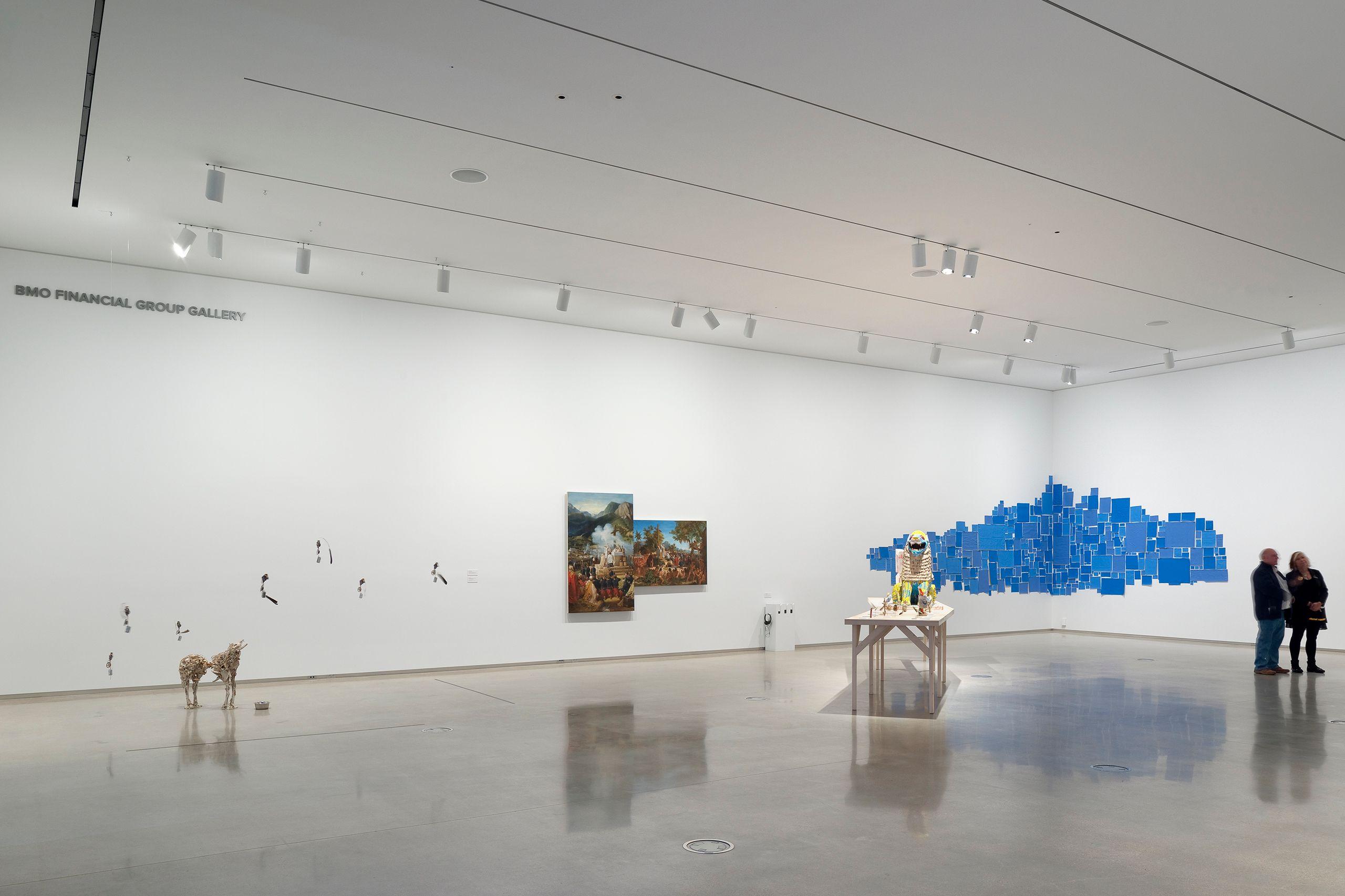
Remai Modern is situated on Treaty 6 Territory and the Homeland of Métis. We worked closely with the local First Nation community to create a visual identity that reflected the relationship between the institution and its neighbors. In Remai’s first six months, 189,000 visitors passed through the doors; equal to the original estimates for the entire calendar year.
"We wanted a visual identity that was both timely and timeless. That is what Karlssonwilker delivered. The resulting visual identity conveys the sense of unruliness we were seeking without resorting to virtuoso visual gestures that would quickly fade."
The logotype is a custom extra-heavy version of Maison Neue, used for all print and online communication when available.

Screenshot of one of the many Illustrator files with the initial type sketches.


Cree syllabics are used in some logo applications as a lock-up. The syllabics themselves are a phonetic re-translation of “Saskatchewan,” determined through consultation with Cree scholars.


The institutional identity focuses on the logo, a color scheme of anthracite and warm yellow, as well as idiosyncratic logo patterns.

All programming collateral is based on The Saskatoon Sentinel, a hand-written newspaper from 1884 that we discovered in the city’s library archives.


Being brought on early in the overall process meant more time to better strategize and plan Remai Modern’s online platform, resulting in a pre-opening version of the website that featured bespoke web commissions that were exhibited on the landing page for over a year prior to opening. Our guideline was to use the website as an extension of the gallery space and put art first.


All wayfinding signs feature yellow backing that gives the edges a subtle glow.